In the final input session of the course Typografie Intensiv, we examined “Systems and Variations” of design. At first, it wasn’t quite clear to me what that meant, but after some explaining, I got it.
“Everything is designed. Few things are designed well.” – Brian Reed
In short: everything in this world is designed. Every design has a system underlying it. And within this system, there can be endless variations.
Snowflakes are one natural example. Or leaves.
Lots of variations can be found in architecture: windows, doors, staircases, door handles even… all of these are variations of the same design within a system.
Applied to typography, that means: Every possible layout of a page is a variation of the system – hopefully a grid – underlying that layout. Also: every font is a variation of its underlying system, the alphabet.
And that is what makes design so great. We saw it time and time again over the past two years: put 20 people in a room together and give them the same design brief – and you’ll get 20 different results. Even if the results are similar (which they hardly ever were) – they’re not the same.
“Learn the rules like a pro, so you can break them like an artist.” – Pablo Picasso
Over the past two years I have learned a lot about typography, grid systems, kerning, good and bad design. But what I’ve really learned: if you are aware of the system (or, best case, you made it yourself), you can move about freely in it. You can even break out of it, if you’re courageous enough.
This also applies to life outside of design*: in the decisions we make as consumers, as voters, as members of society, it’s important to be informed about the system, so that you can move about freely in it. And maybe even break out of it.
(*yes, I am aware we just agreed everything is designed, which would theoretically make ‘life outside of design’ impossible, but you know what I mean.)
systems all around
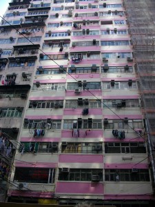
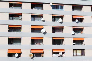
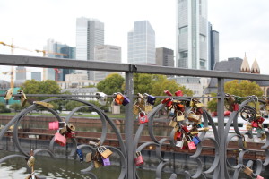
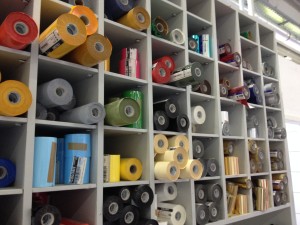
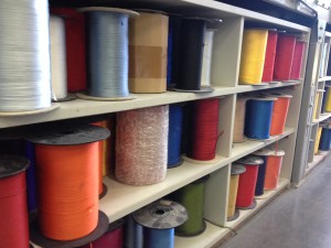
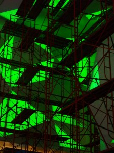
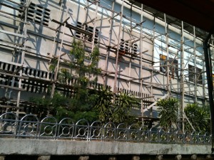
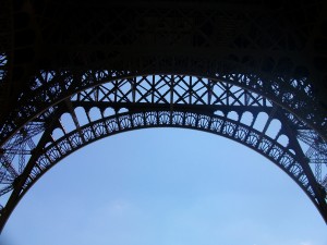
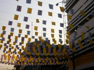
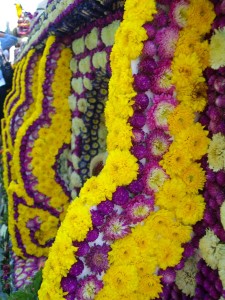
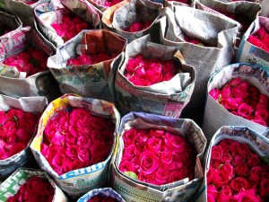
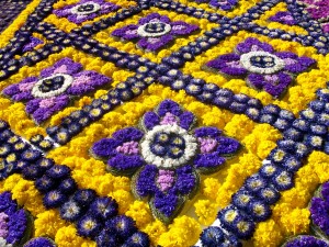
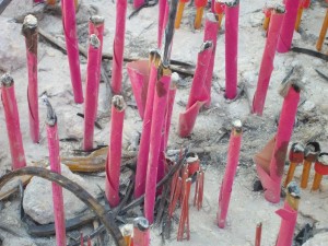
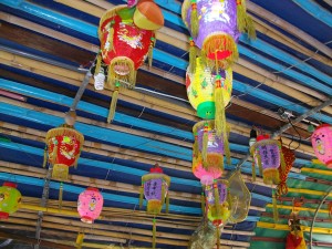
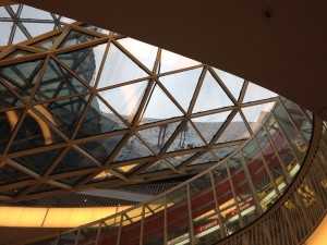
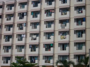
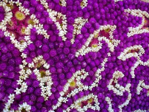
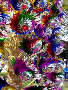
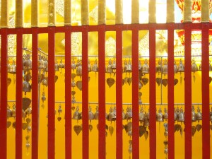
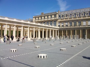
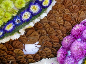
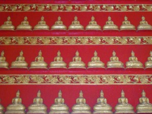
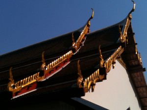
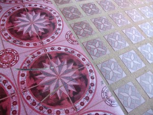
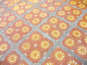
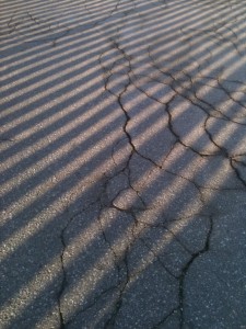
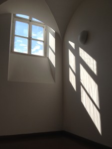
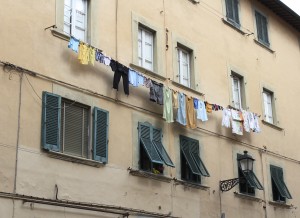
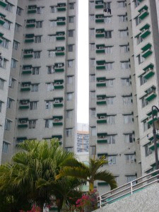
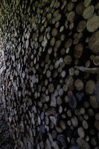
My heightened awareness for systems and design caused me to browse through my personal photographs. I noticed quite a while ago that when I’m not stressed, when I’m “in the zone” or “in the flow”, I take good photos. And it’s not just that I like them more because I feel the positive energy I felt while taking them; I try different things, photograph from different angles, try various compositions – I simply see the world differently. To my surprise, quite a few of these good photos included patterns. Which, in essence, is of course nothing if not systems and variations of systems. (Please note that this is quite a loose category; basically, it’s everything that repeats itself in some way and therefore qualifies as a variation of the thing next to it.)
So here they are, the ‘systems and variations’ I saw even before I was aware of them. Now that I’m aware, I hope to capture them even better – on camera, in my designs, and in a conscious lifestyle. Maybe they’ll inspire you to do the same. If not, you’ll have looked at some pretty patterns, which is always nice. Enjoy!











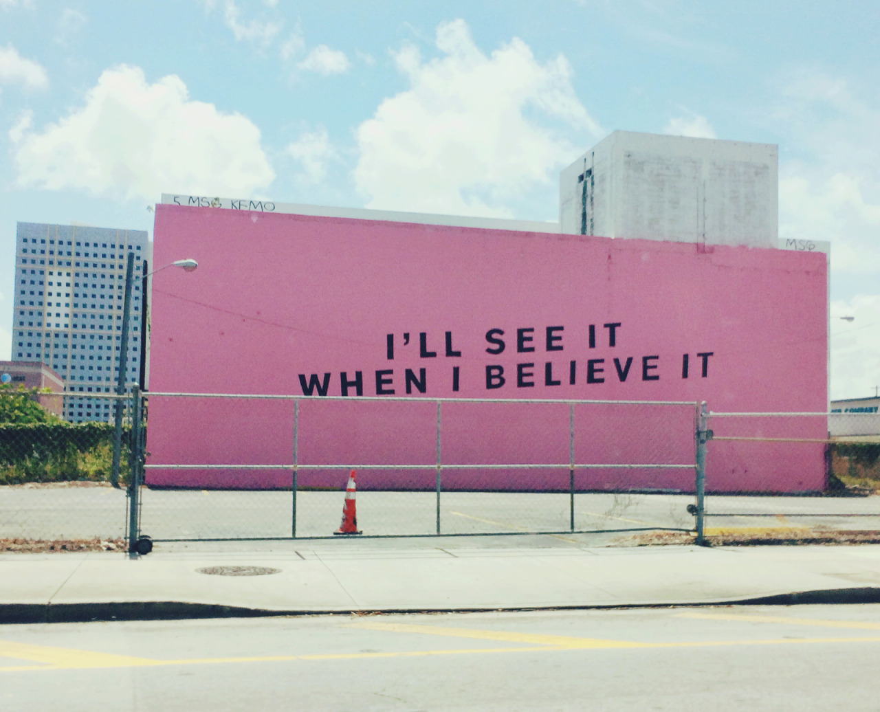 I'll see it when I believe it, Miami Beach. found at kalterhimmel.tumblr.com