Examples of excellent editorial typography
“Typography? What’s that good for?”
I’ve been asked this question many times before. Either it’s because the person didn’t know what typography even was, or didn’t see that it’s needed in the world.
To clarify, here’s the definition from Wikipedia: “Typography is the art and technique of arranging type to make written language most appealing to learning and recognition. The arrangement of type involves selecting typefaces, point size, line length, line-spacing (leading), letter-spacing (tracking), and adjusting the space within letters pairs (kerning).”
Most typographers and designers agree with this definition. However, good typography does much more than simply “make written language most appealing”. In many cases, it leads the eye to the information that is important. Good newspaper layouts make it easier for you to scan the articles you want; nicely arranged homepages make sure the text is short and the length of the lines isn’t as long as they would be in a book. White space is crucial, allowing your eye and brain to discern which characters belong where. So really, good typography saves you time and energy when reading.
Pleasing results
You’ve most definitely encountered bad or unfortunate uses of typography – sadly, even in professional products like books, magazines, or on big companies’ homepages (where you wouldn’t expect it). Instead of showcasing uses of typography gone wrong, though, I’d like to showcase four examples of typography put to good use.
In the course of the last year, I’ve come across four magazines that are incredibly well done. They’re easy to read, pleasant to look at, and just generally typographically pleasing. Two of these magazines (flow and novum) touch upon graphic design and paper as topics. Now, you might say “Well that makes sense that their use of typography is good, if that’s what they’re talking about.” True. Which is why I’d like to talk about my two favorite magazines that don’t have anything to do with typography, layout, or graphic design as topics. They simply put these tools to exceptionally good use.
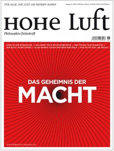
This is my latest discovery, and my new favorite. It’s a philosophical magazine, for “people who enjoy thinking” (“Für alle, die Lust am Denken haben”). Yes, you read correctly: a magazine on philosophy. Honestly, I didn’t know such a wonderful thing existed. The magazine discusses everyday topics (money, power, war, etc.) in light of philosophical theories.
Not only are the articles well-written (and easy to understand for those non-philosophers among us), but the graphic concept of the magazine is also clean. conscise, and airy. (Maybe that has something to do with the title?)
The logo mixes small caps, lower case, and upper case letters successfully. It looks harmonious, as do all the running titles in the magazine, which are done in the same way.
A two-columned layout is used throughout the magazine, achieving a calmness on the page and flow for reading the articles. These are visually broken and spruced up by using minor design details, for example: initials – some of which even boldly go over 14 (!) lines. Different colors and typefaces for the headlines add to this variety, yet the continuous text is always kept in the same typeface, ensuring that lovely calmness on the page.
In addition to this thoughtful use of typography, the magazine also includes beautiful illustrations and photographic essays.
Truly a treat for anyone who isn’t wondering what Kardashian’s butt is worth or where Rihanna’s latest tattoo is, but is also too impatient to really read DIE ZEIT’s yard-long articles.
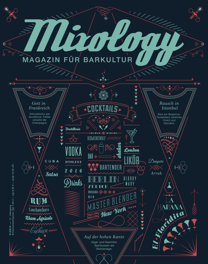
The second magazine I want to bring to your attention, if you don’t know it already, is Mixology – Magazin für Barkultur (Magazine of Bar Culture).
The first thing you may notice – apart from its catchy cover designs – is its paper. It’s not glossy, and it’s not cheap. It actually feels – and smells! – like paper.
The magazine mixes a two-column and three-column layout, but what really catches the eye is its use of non-mainstream type. It’s so non-mainstream, if I tell you the names of the fonts I identified with WhatTheFont, you’d probably say… nothing. (Or does Cloister Open Face ring a bell to you?)
What one can say, though, is that Mixology not only talks about mixing drinks well – it also mixes fonts well. In one issue alone, I counted almost a dozen fonts or styles of font, and yet the layout looks… how to say it?… shaken, not stirred. It may not sound like a lot of fonts to you, but the general rule is to stick to a maximum of three fonts or styles of font for a page; for a magazine, that usually means no more than six fonts should be enough variety for all the possible sections you can think of combining. Yet here, there are many more fonts used – and still, they mix harmoniously.
What else is there to say? The magazine uses a nice balance of black and white, both for background and type. Even in its advertisements (however they managed that). It’s an all-round viewing and reading pleasure.
If you’re a sensualist and you appreciate the culture of your drinks, you’ll like the magazine and its culture of editorial typography.
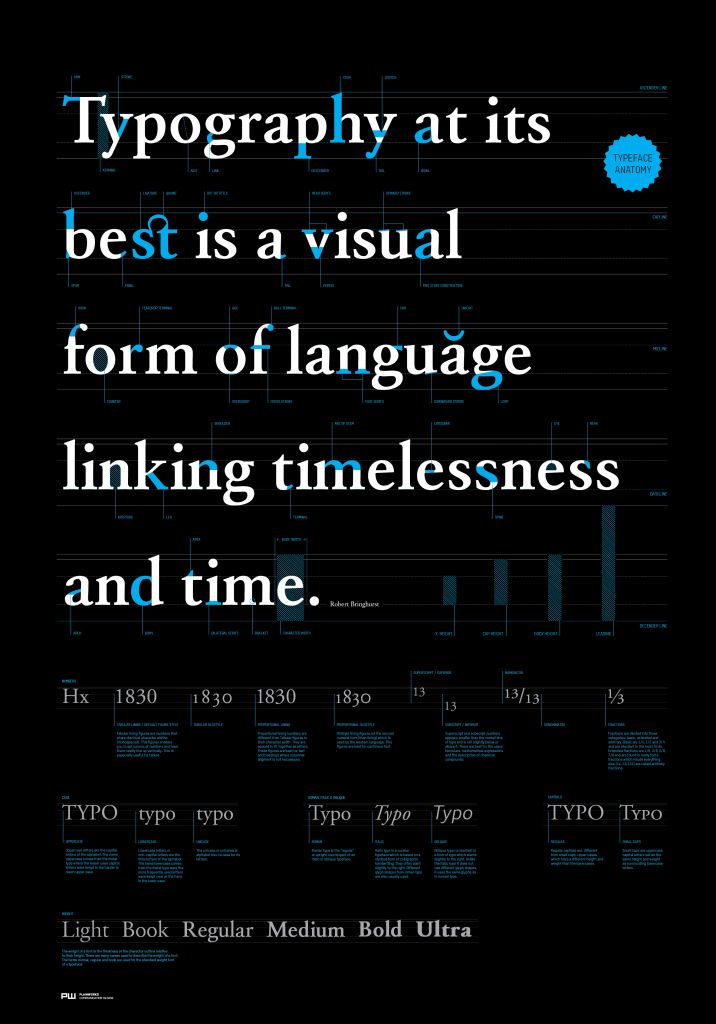 Typography at its best. Plainworks Communication Design, www.plnwrx.com