This time around for my lettering work for die Wilderin, I chose the quote Wer nicht genießen kann, wird ungeniessbar. by Goethe.*
linguistic duality
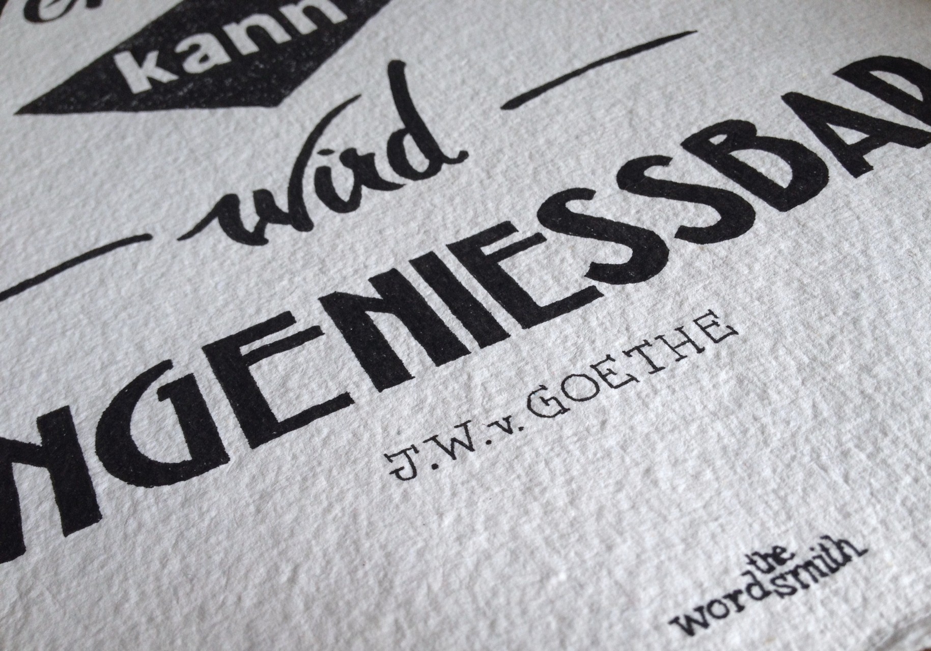
The beauty of this quote is the dual meaning of the word ungenießbar: in reference to food, it means “unenjoyable”; in reference to people, however, it means “unbearable”. From the beginning, I knew I wanted to reflect the difference in meaning of the words genießen (enjoy) and ungenießbar (unbearable) with their lettering style.
duality of design
The juxtaposition of the two words worked best when they were able to stand on their own, which is why I opted for a relatively loose layout in a portrait format.
Also, since I’m constantly trying to improve the calligraphic side of my work, I played around with two different styles of calligraphy, one in the word genießen (enjoy) and one in the word wird (become).
contradiction, juxtaposition
It’s an unspoken rule (and also an outspoken one, actually) of typography and lettering that you shouldn’t use too many styles in the same layout, as they tend to make it pretty noisy. In this piece, I broke the rules and did just that. All in all I think the different types of lettering styles contribute well to the contradictory meanings of the words in the quote.
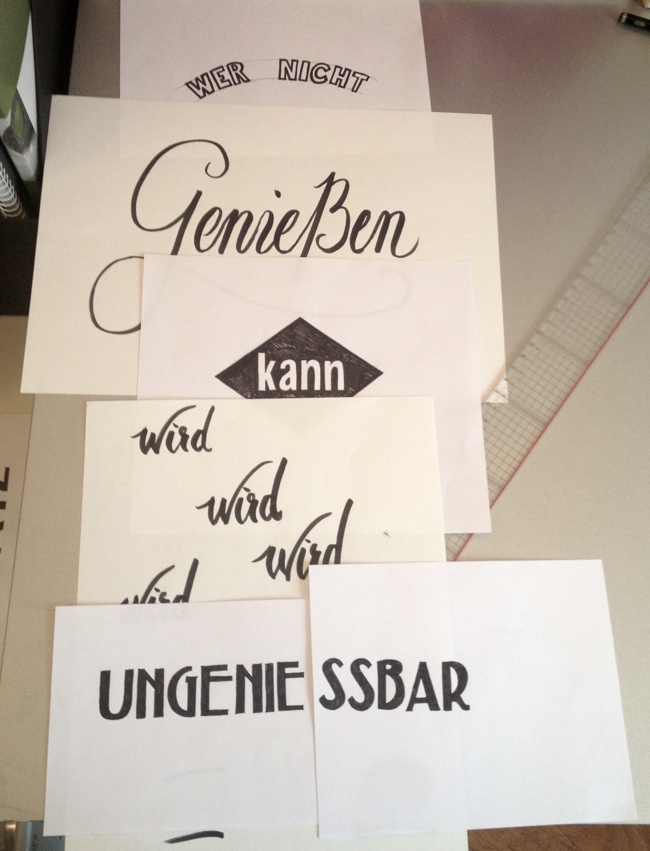
Here are some photos of my lettering process:
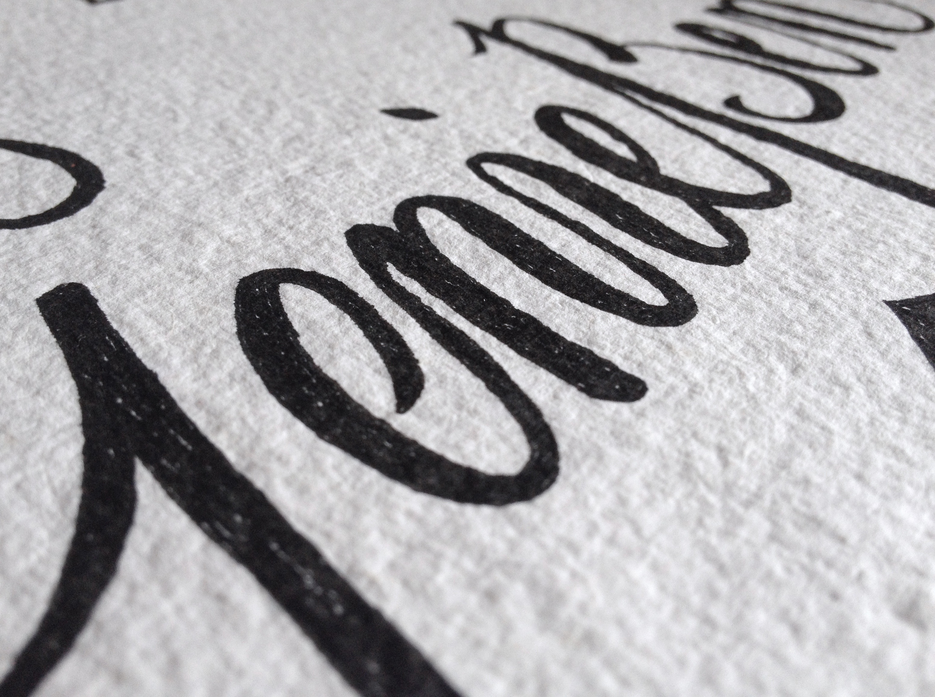
geniessen close up
composition
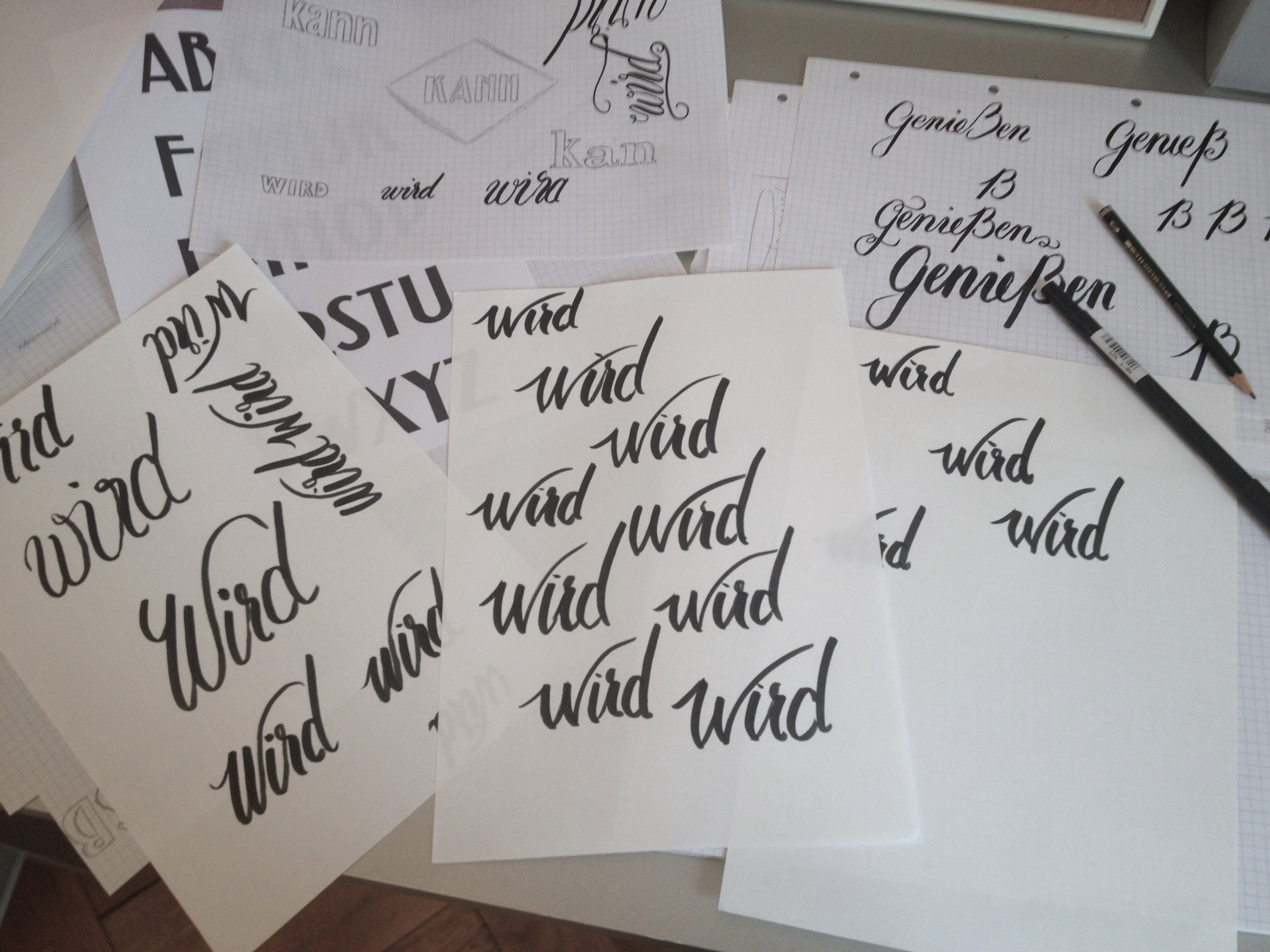
letterform practice
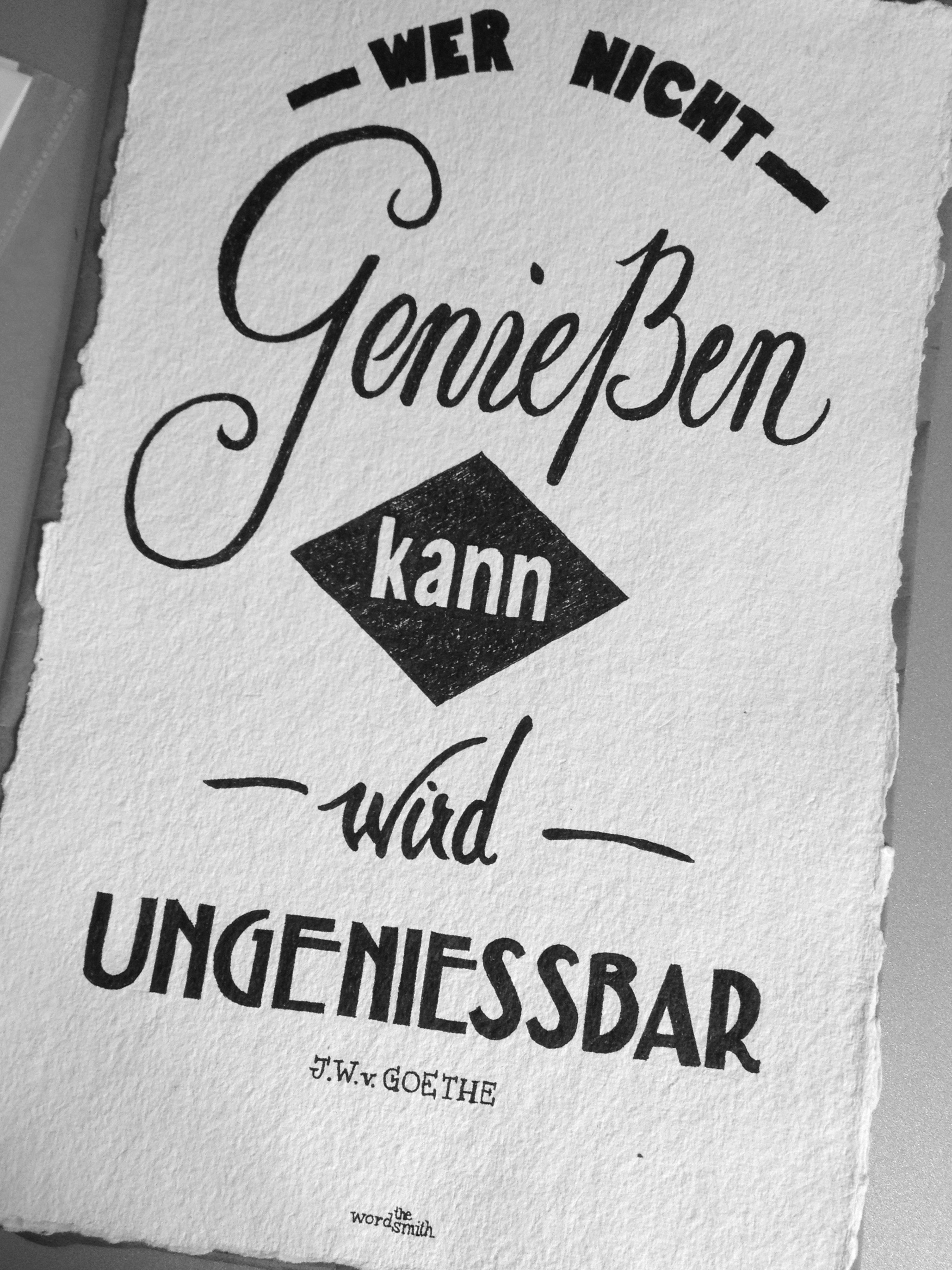
final
*Rough translation: He who does not enjoy life becomes unbearable.
 ...wird ungeniessbar