How do you choose a font?
I don’t know how other people choose their fonts, and sometimes I’d prefer not to know, considering some of the decisions made out there.
As in all trades, there are theories on how to choose the right font for what you want to convey. You might consider legibility, style, distinctiveness, etc. Indra Kupferschmid classifies fonts according to their effect – whether they’re dynamic, static, or geometrical.
All of this makes sense, and they’re good theories to consider. But that’s all they are: theories. In practice, you don’t always consider these theoretical aspects – at least not on a conscious level.
How I choose fonts
So I can’t tell you how other people choose their fonts. However, what I can tell you is how I choose fonts. Brace yourself: this is personal. I choose my fonts like I choose my friends and partners. Meaning, I don’t really – they choose me.
Of course, when I consider a font for a project, I think about what it should convey, how it should look, the style it should have, etc. I look at an array of typefaces that come from that particular style (humanist, modern, sans serif, etc). I study them. I look at each glyph individually, often at specific glyphs in combination.
But then I find myself choosing a font/typeface because of one particular character. Something about that one particular glyph just captures me, speaks to me. At this point, I’m pretty giddy, and usually a bit impatient. It’s like I have butterflies in my stomach. So, I quickly scan the other glyphs once more to see if they’re alright – and I’ve made my choice. It’s a complete gut brain decision.
So then I try out the font in my project. Once I’ve used it, a calmness sets in. After all, once you’ve decided on a font, you have to accept all of its characters. A lot of thought went into the making and designing of the font, and you should respect that. You can’t just change a character here or there because you don’t like it.
Characters and character traits
It’s like in life, in relationships: You see someone you’re interested in. Something about this person catches your eye. It might be the way he laughs, or the way she looks into your soul when you talk; a witty remark, a catchy line, maybe a dance move – and you’re hooked. Because of this one particular character (same word even!) trait, you decide to inspect the person more closely. To include them in your life. Only then do you notice the smaller, not-so-dashing character traits in the person (and characters in the font). But you accept and love the font (or person) anyways, because you still feel it was the best choice for you at the time.
If you’re lucky, you’ve chosen a font that works for your project, whether or not you actually use the particular glyph that caught your eye in the beginning. Even if some other glyphs (or character traits) begin to bother you. Similar to a happy relationship/friendship: the particular character trait that caught you in the beginning may or may not fade, and additional traits that you might not be too happy with may or may not appear. But overall, you’re still happy with your choice.
Take your time!
I spent months (yes, I’m not kidding: months) searching for a font that would look the way I wanted it to for my corporate identity. Respectable yet fun, a text font that had a rich tradition but looked more modern than, say, Garamond or Didot. When I came across what was to become “my” font, I instantly fell in love with the capital italic W because of its swash.
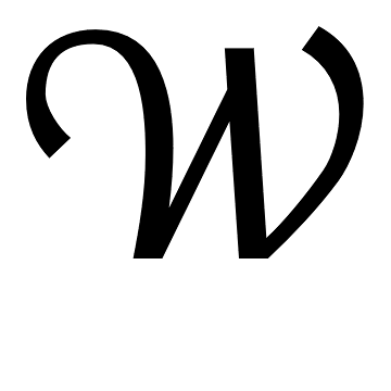
swash W
Funny thing is that even though I don’t even use the character that I love in my corporate design, my relationship with my font is still a happy one. It remains a good choice. It’s legible in print and on screen, and it looks serious and yet a bit different. And apart from a few characters that bug me, it conveys what I want it to.
So, however you choose your fonts, the best advice I can give you is to take your time to decide. Don’t just choose fonts that are free, or that you’re used to seeing. Check the fonts’ backgrounds, try them out, print them out (!), let them sit for a while. Then go back and look it all over. And then just let your feelings take over and decide for you. You might just end up as happy as I am… font-wise!
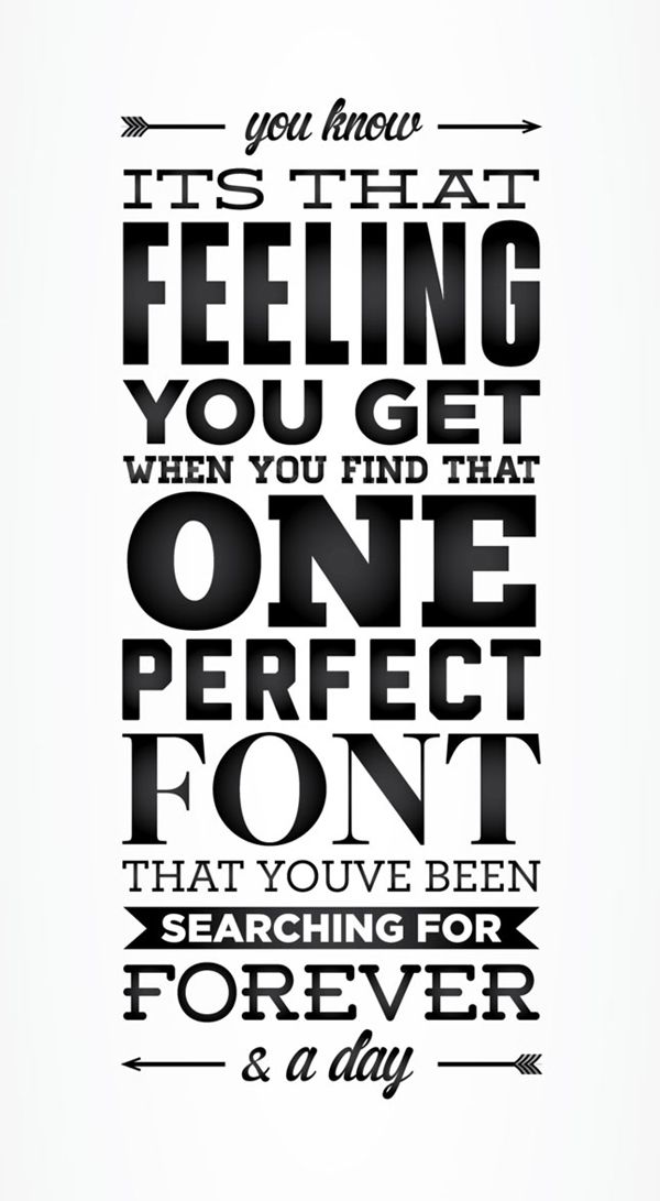 that feeling you get. josephmakes.tumblr.com