Helvetica forever?
As you may know, the Swiss have a reputation for good, clean design and great typography. Take Helvetica: never before has the world had such a neutral typeface, one that can be filled with just about any meaning and emotion out there. It can be used for a sports brand as well as for an airline, or a hip clothing company, among thousands of other uses. It’s there and it’s neutral. Like Switzerland. Whether you’re a fan or not – you can’t deny its usability. And therefore, its success.
When you walk the streets of Zurich, like I did this past weekend for the first time since typography entered my life, you can’t help but think that the Swiss are proud of this font. It’s everywhere. And so is good, clean typography. Not once (!) did I see an ugly sign… well, OK, maybe just one: the ice cart at the lake read “snack’s”. But if you consider the professionally made signs, there wasn’t a single one that stood out negatively. Amazing to me, really, considering some of the store signage we have in Austria, which is really just around the corner.
What is the Swiss style, exactly?
So apparently, the Swiss style has tradition in Switzerland, and has managed to hold its own, even today. But what exactly does this style entail? To put it in the words of the Swiss Style International Graphic Design Exhibition at the Museum für Gestaltung, Zürich that I visited while in Zurich: Swiss typography “describes the constructive graphic design of the 1960s and 1970s. Of main interest here is […] an officially sanctioned visual language[:] reduced, functional aesthetics became the international standard.” Clear structures, photographs rather than illustrations, and abstract, reduced design is the result.
Neutral, or not neutral?
This Swiss style is visible throughout Zurich, but so are other, more decorative styles – as in any city that has a rich history. In the few days that I was there, I collected a few impressions of this interesting mixture of Swiss functionality and Alpine, Central European history; some of which you can see in the photos of street typography I took. If you have trouble understanding the quality of reduced design, I’d suggest you visit Zurich. When you look around, you’ll know what its worth.
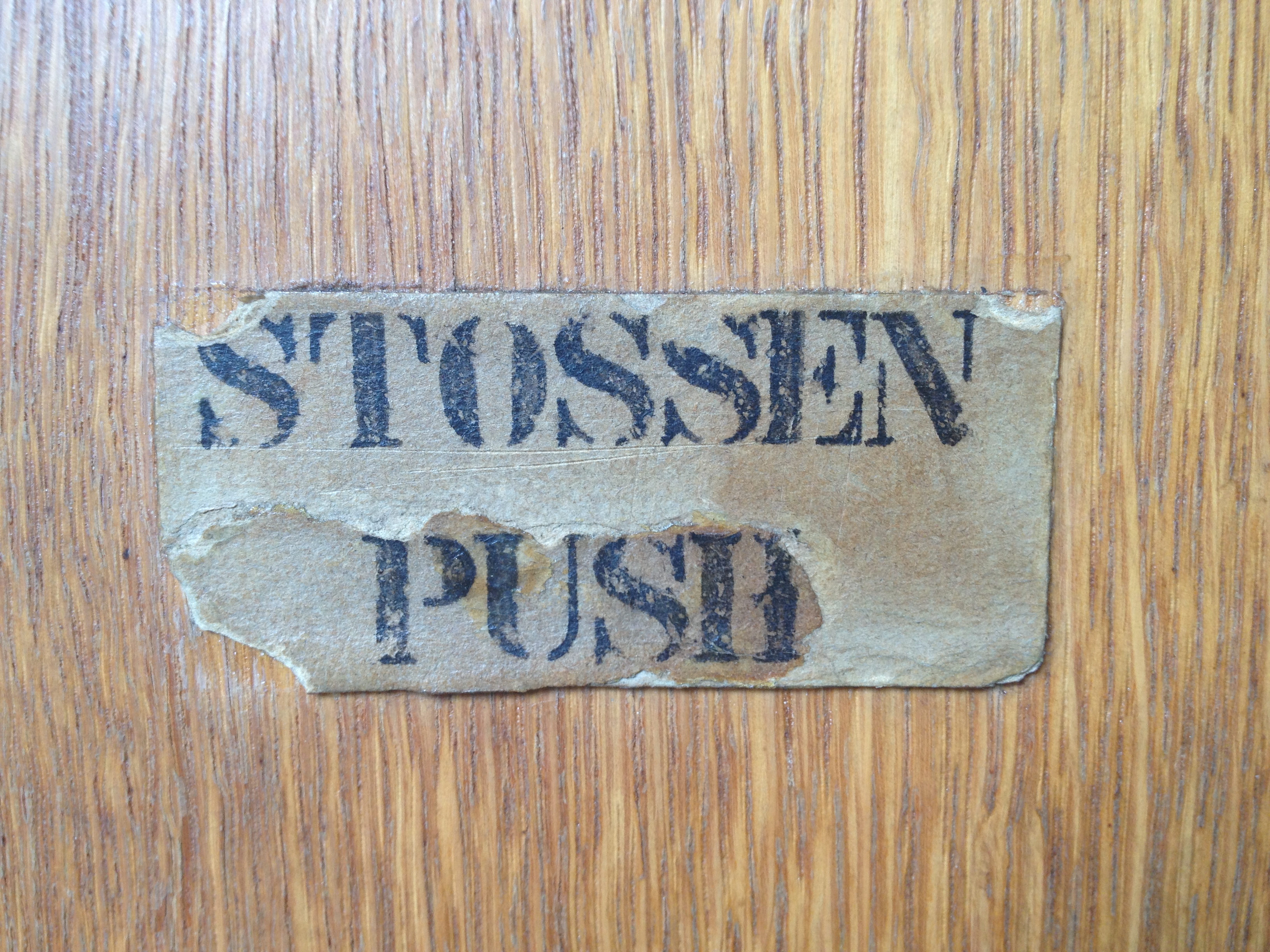
stossen. Zürich
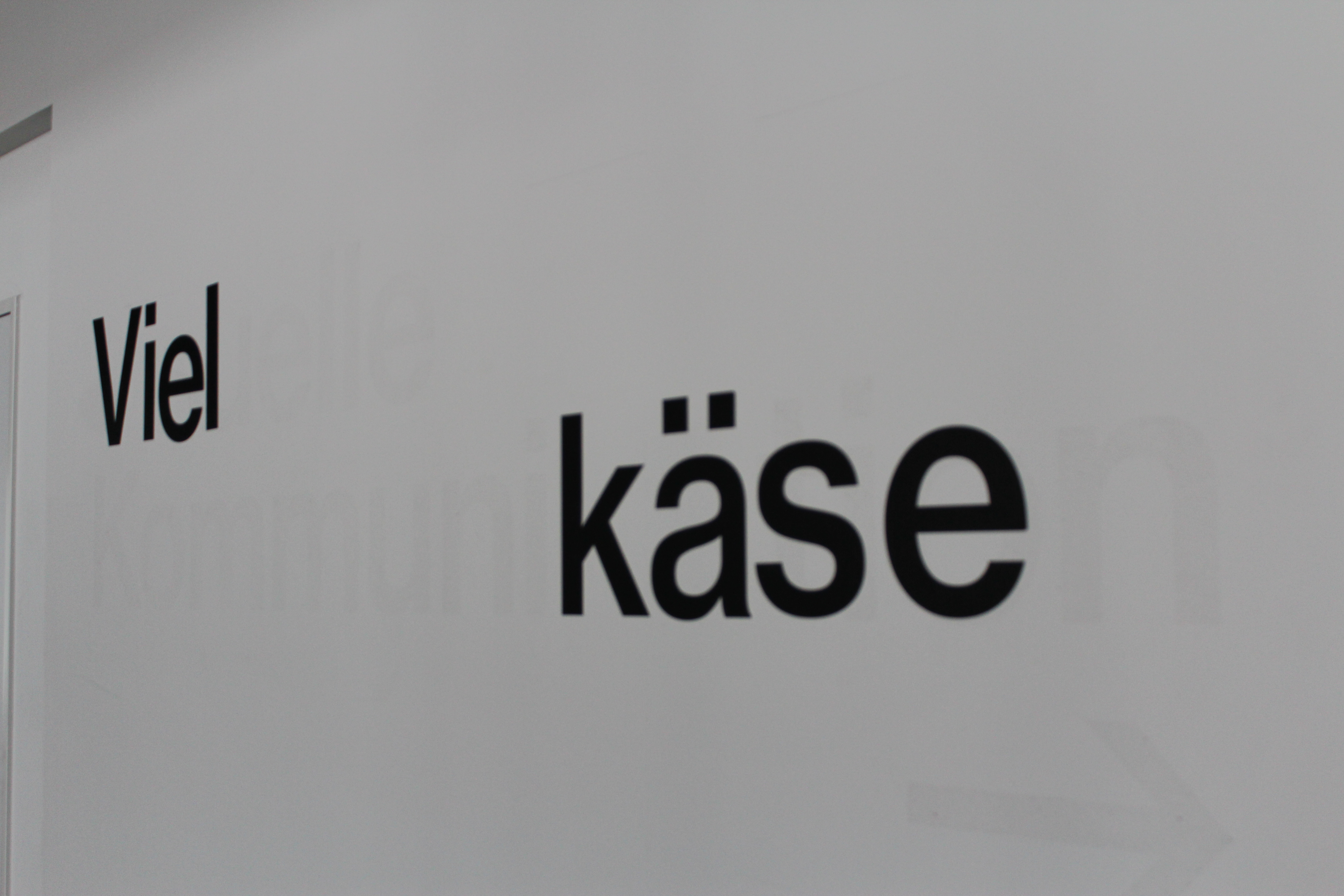
viel käse indeed
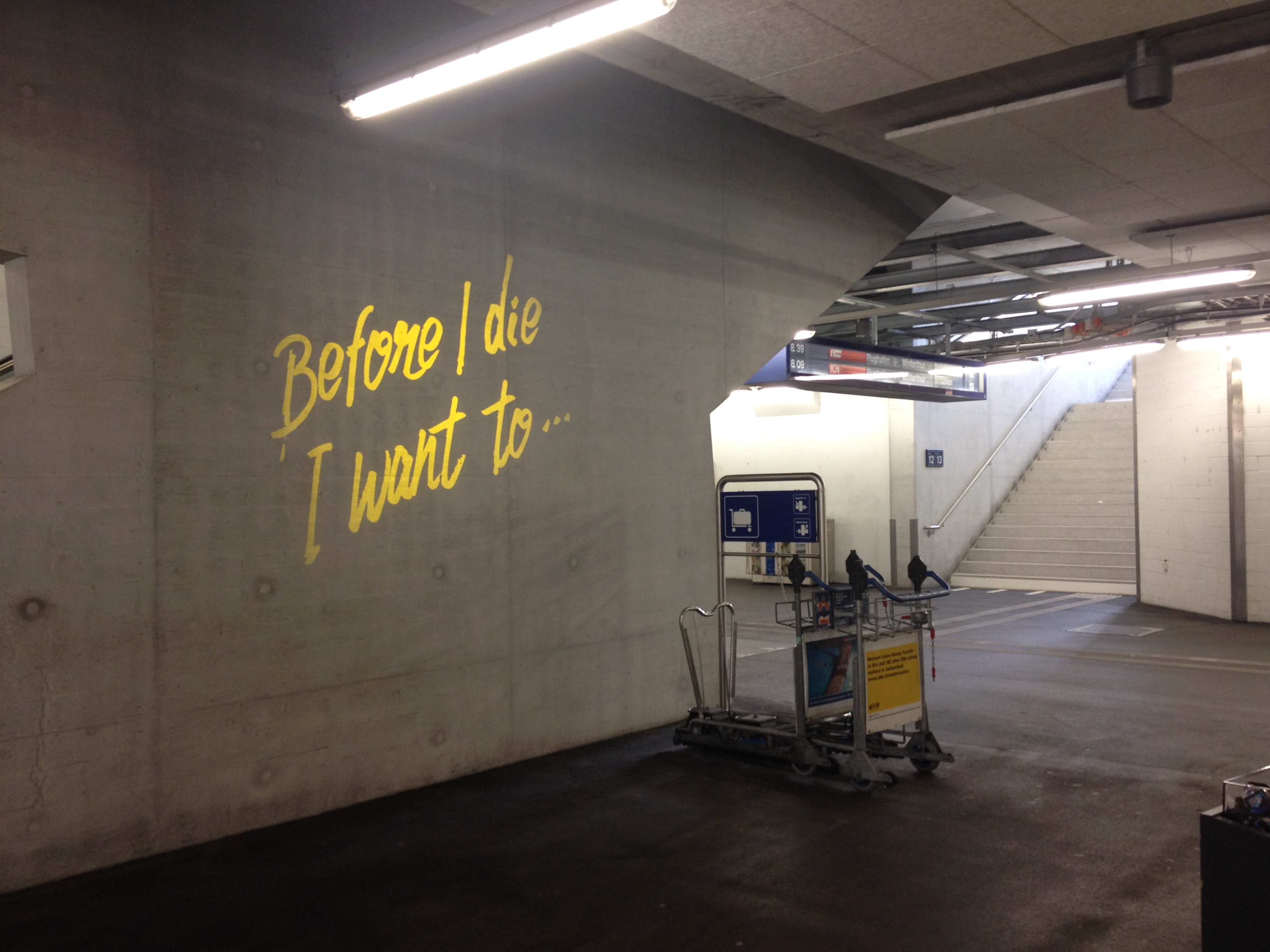
projected street art at the Zürich train station
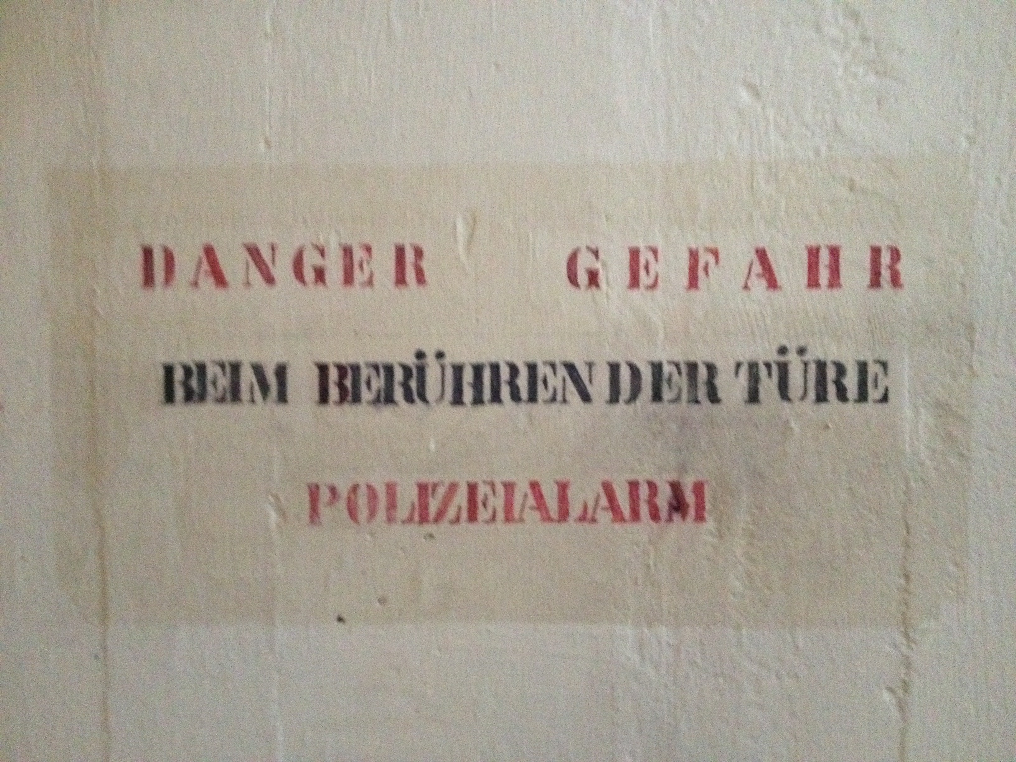
danger bunker door, Zürich
cool poster, Zürich
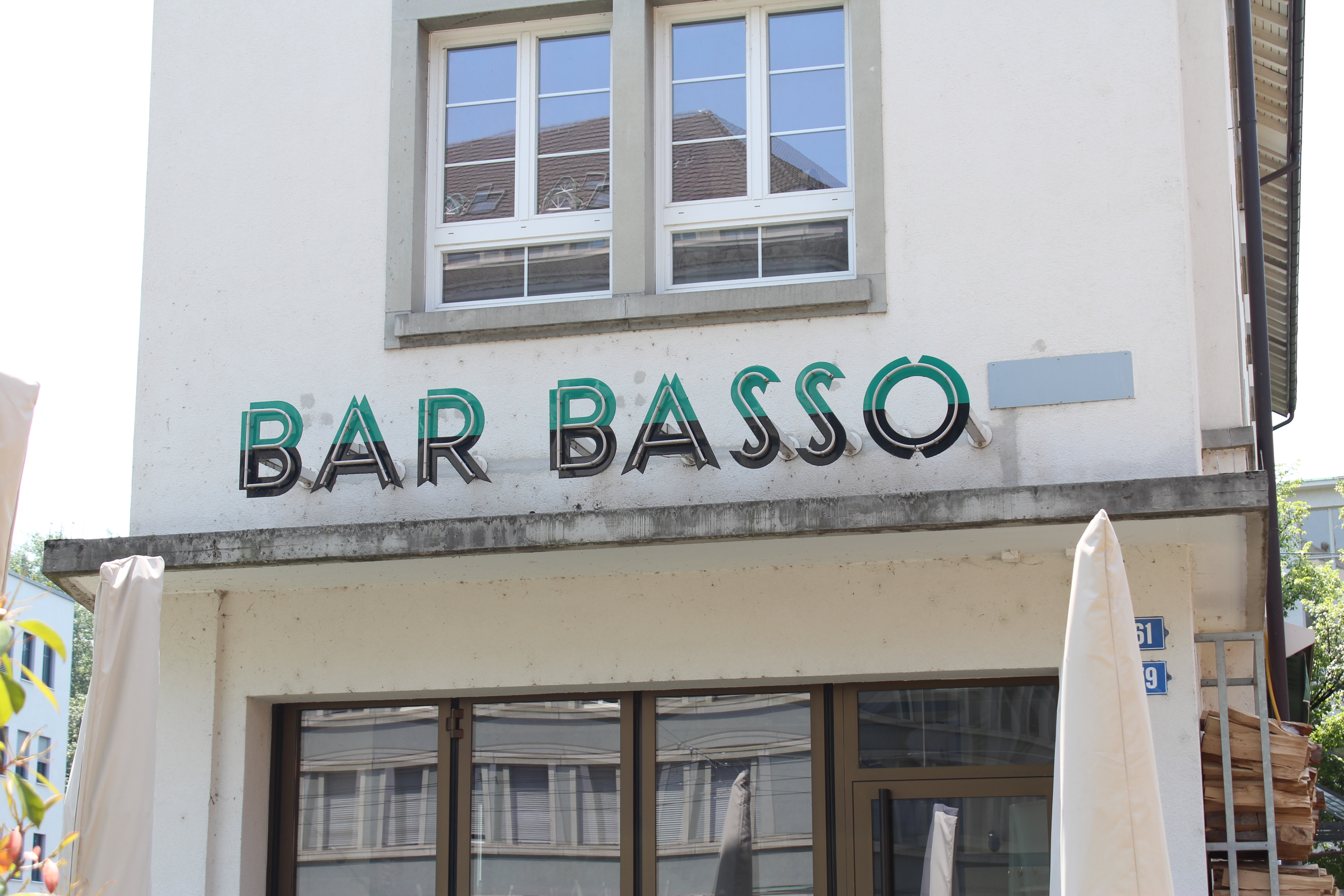
Basso, Zürich
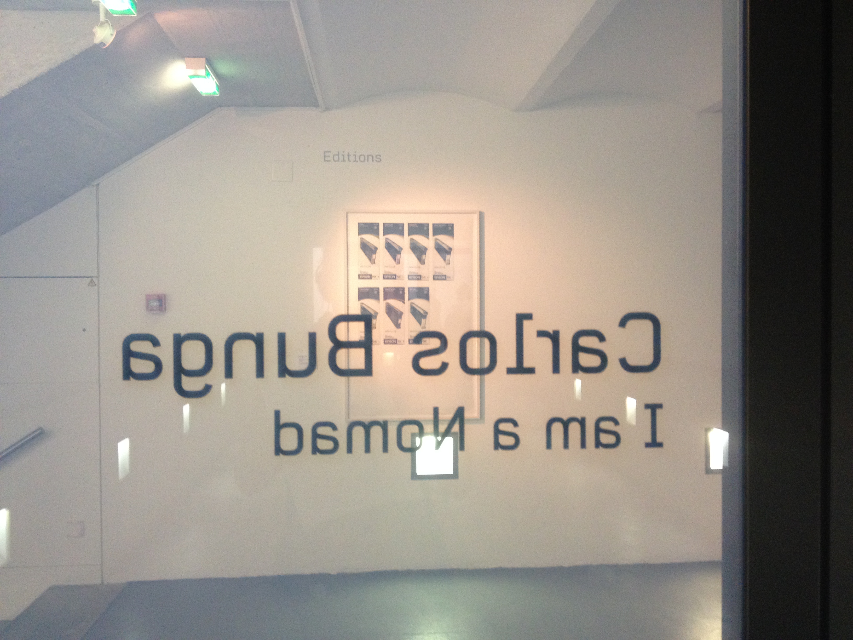
Carlos Bunga exhibition, Zürich
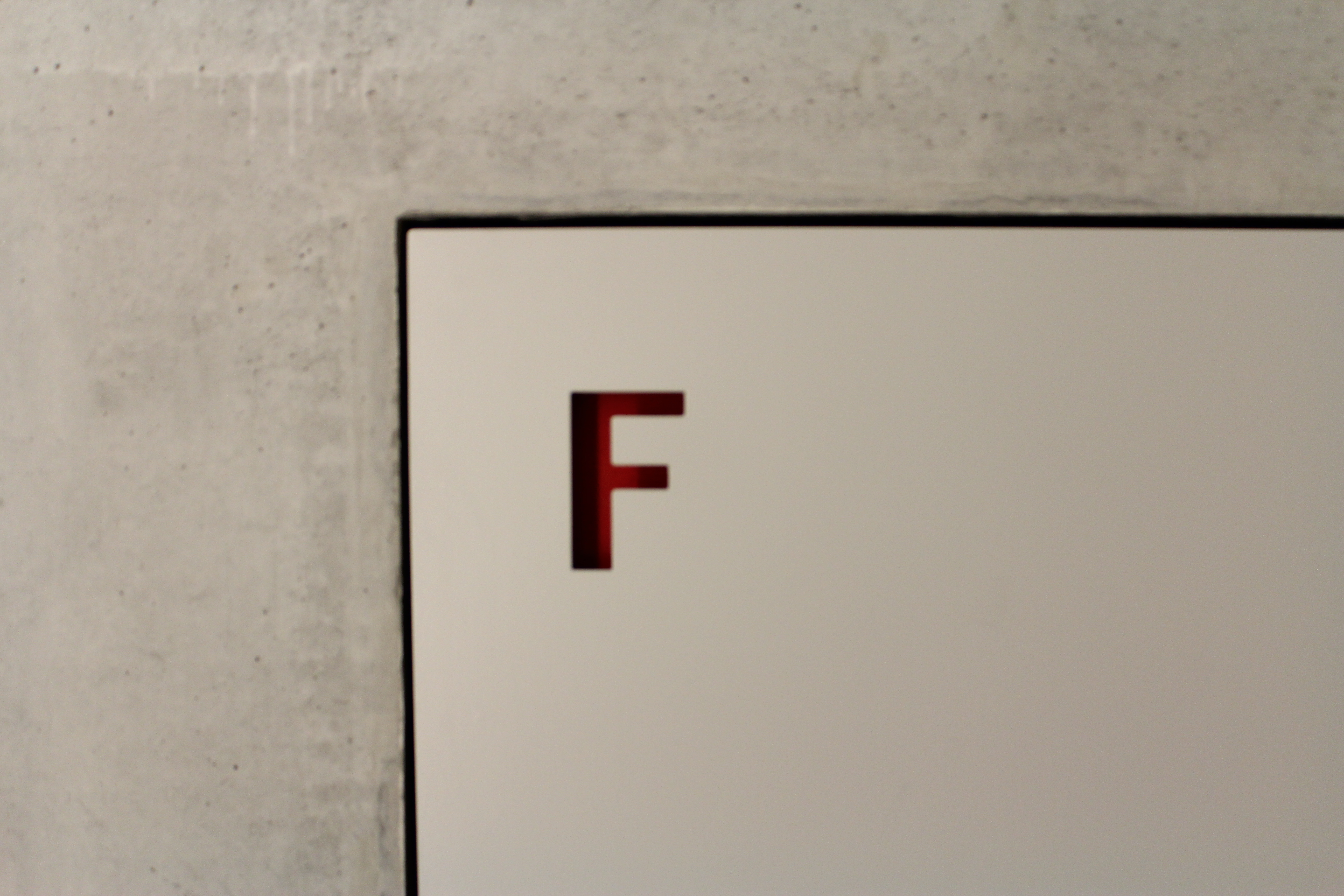
fire hydrant signage, PH Zürich
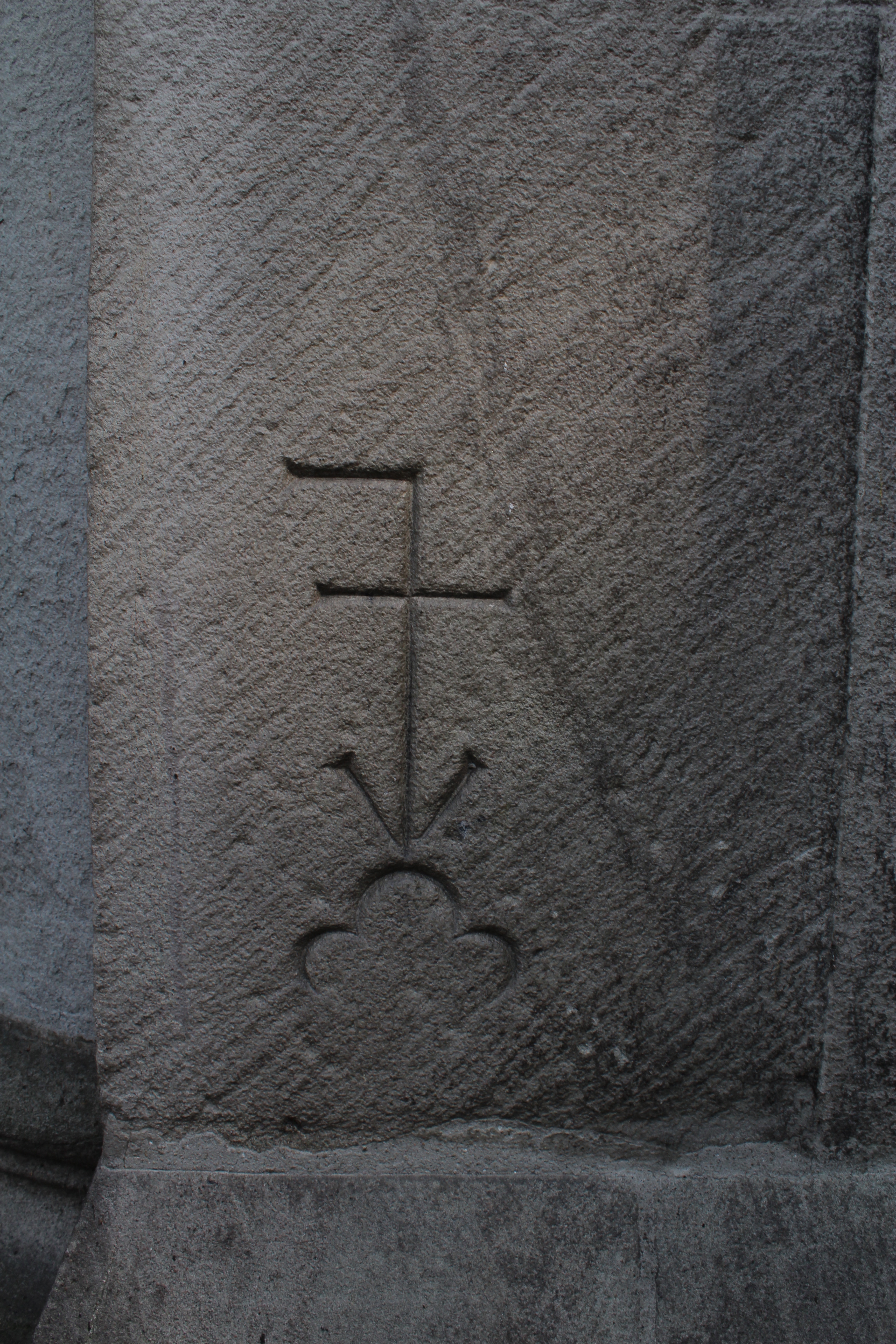
in the church wall. Zürich
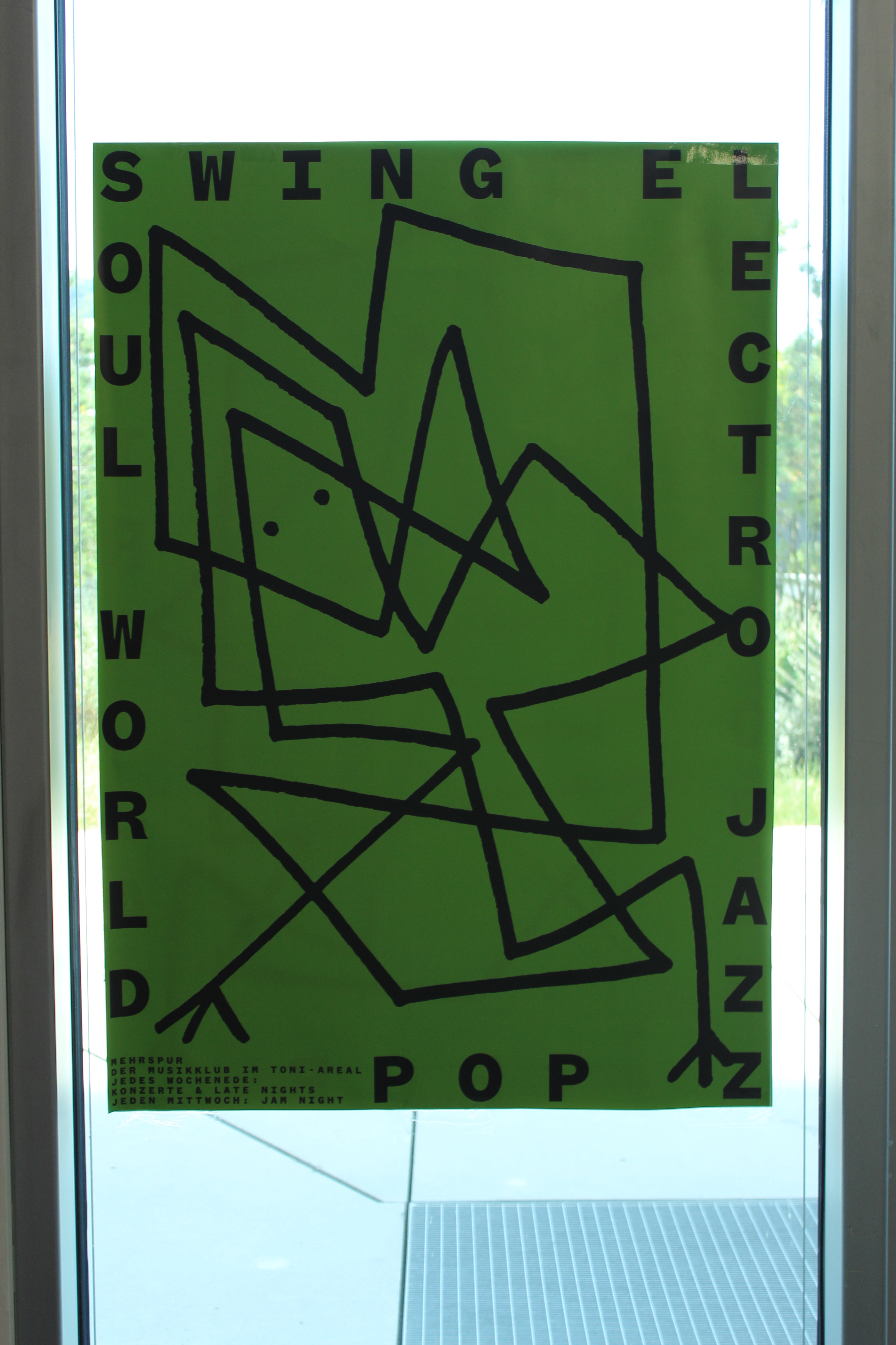
inside the Toni Areal. more bent letters
it’s a baby letter opener! no, wait…
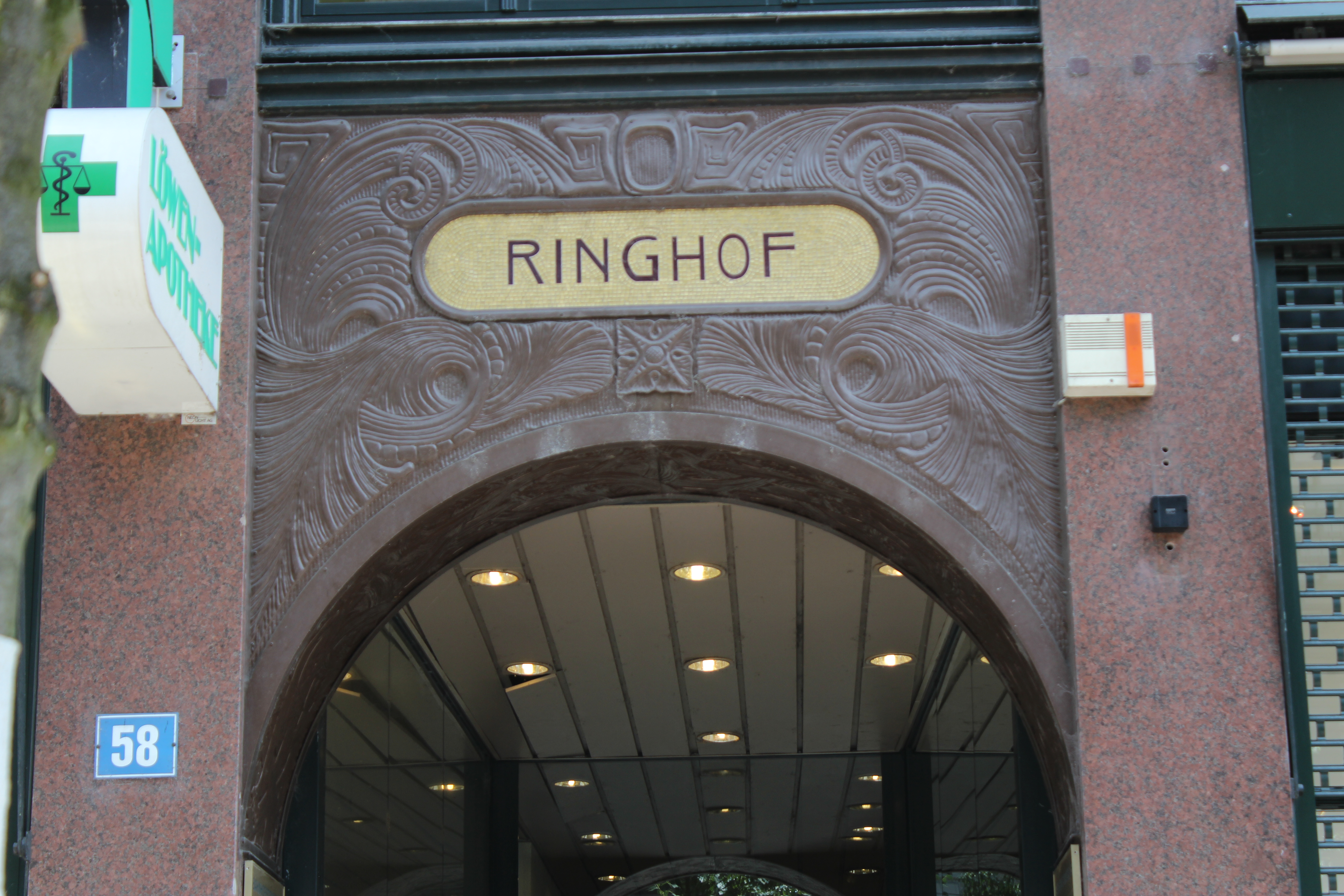
Ringhof, Zürich
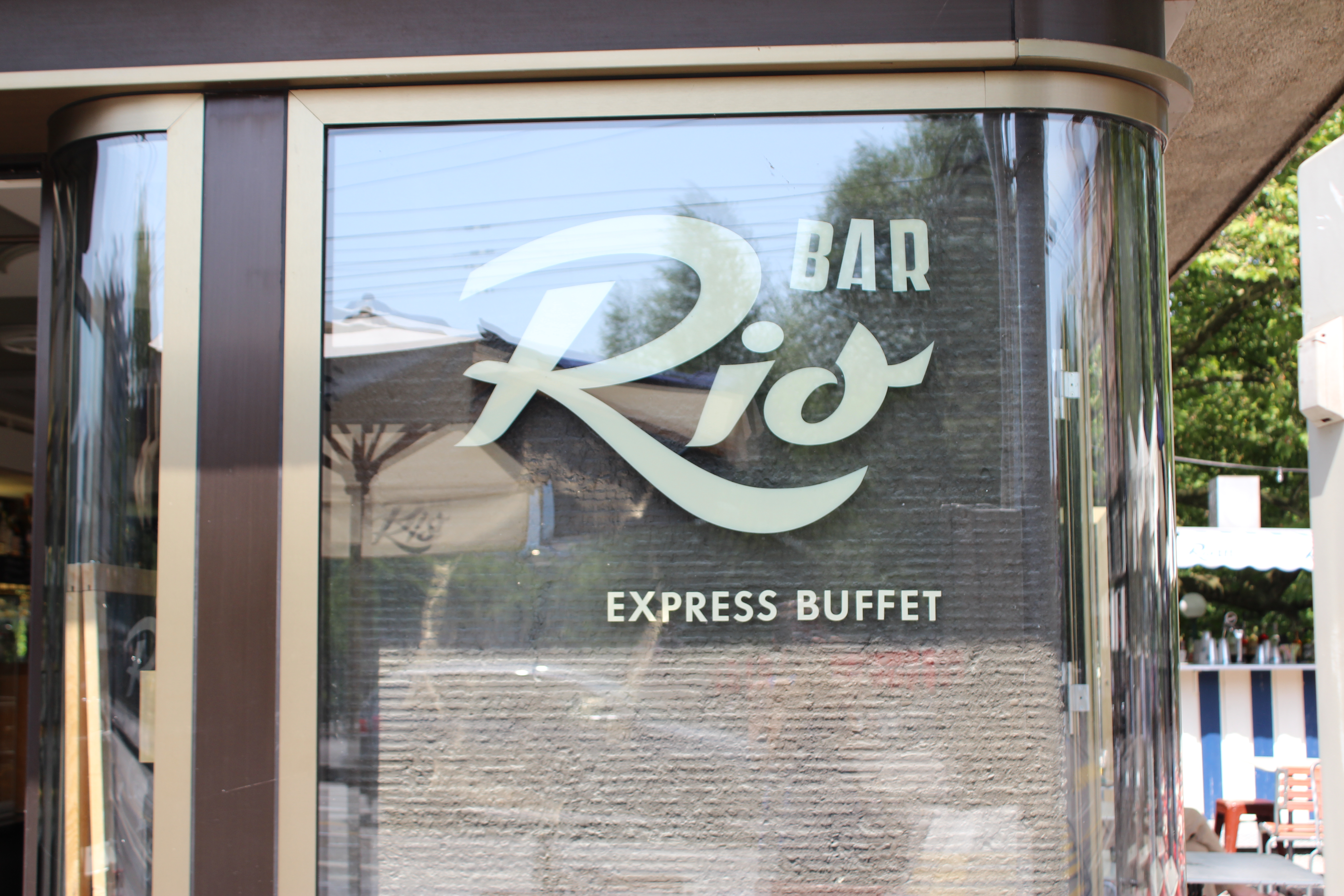
Rio. Zürich
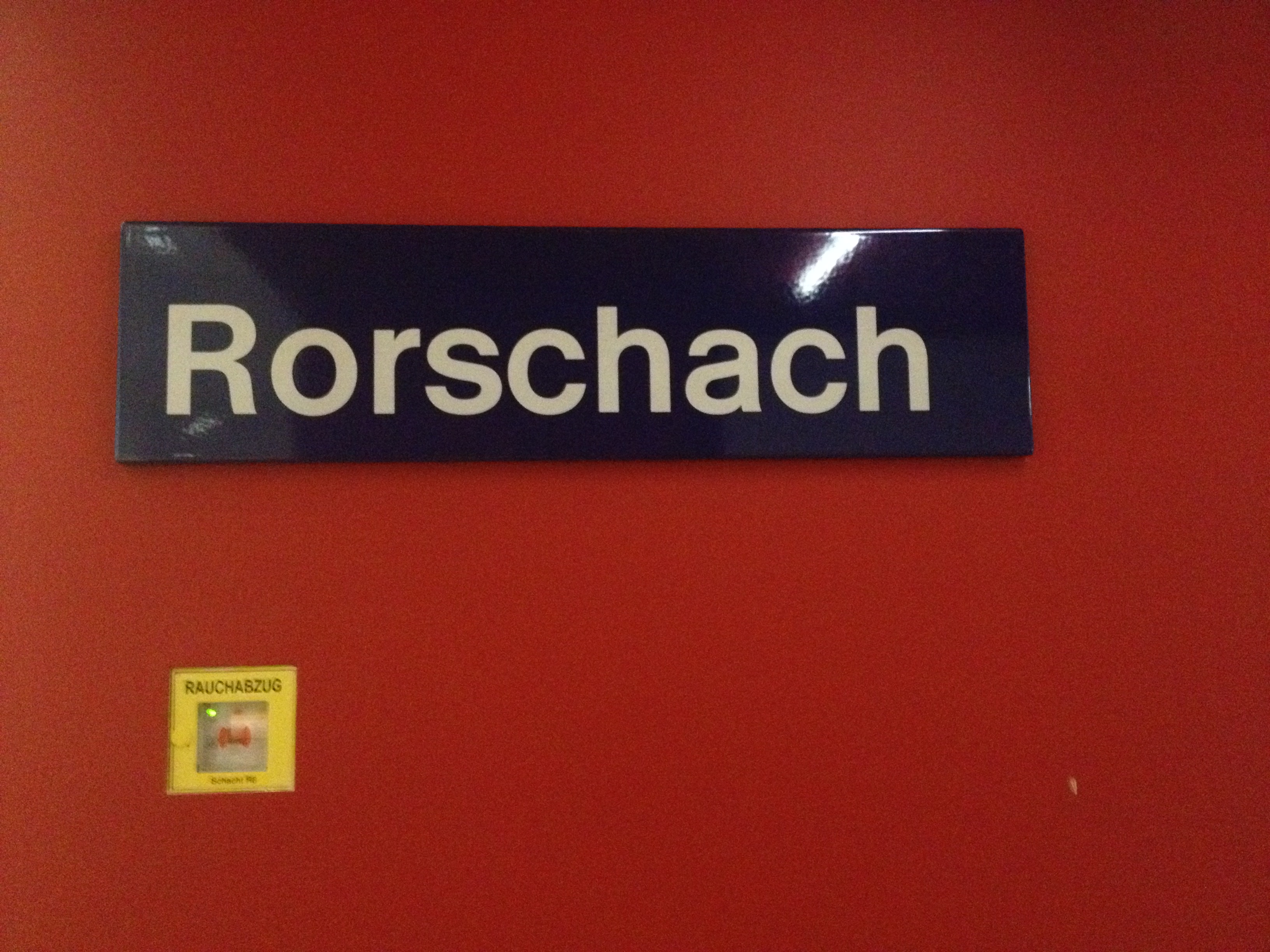
Rorschach, Swiss Type Exhibition
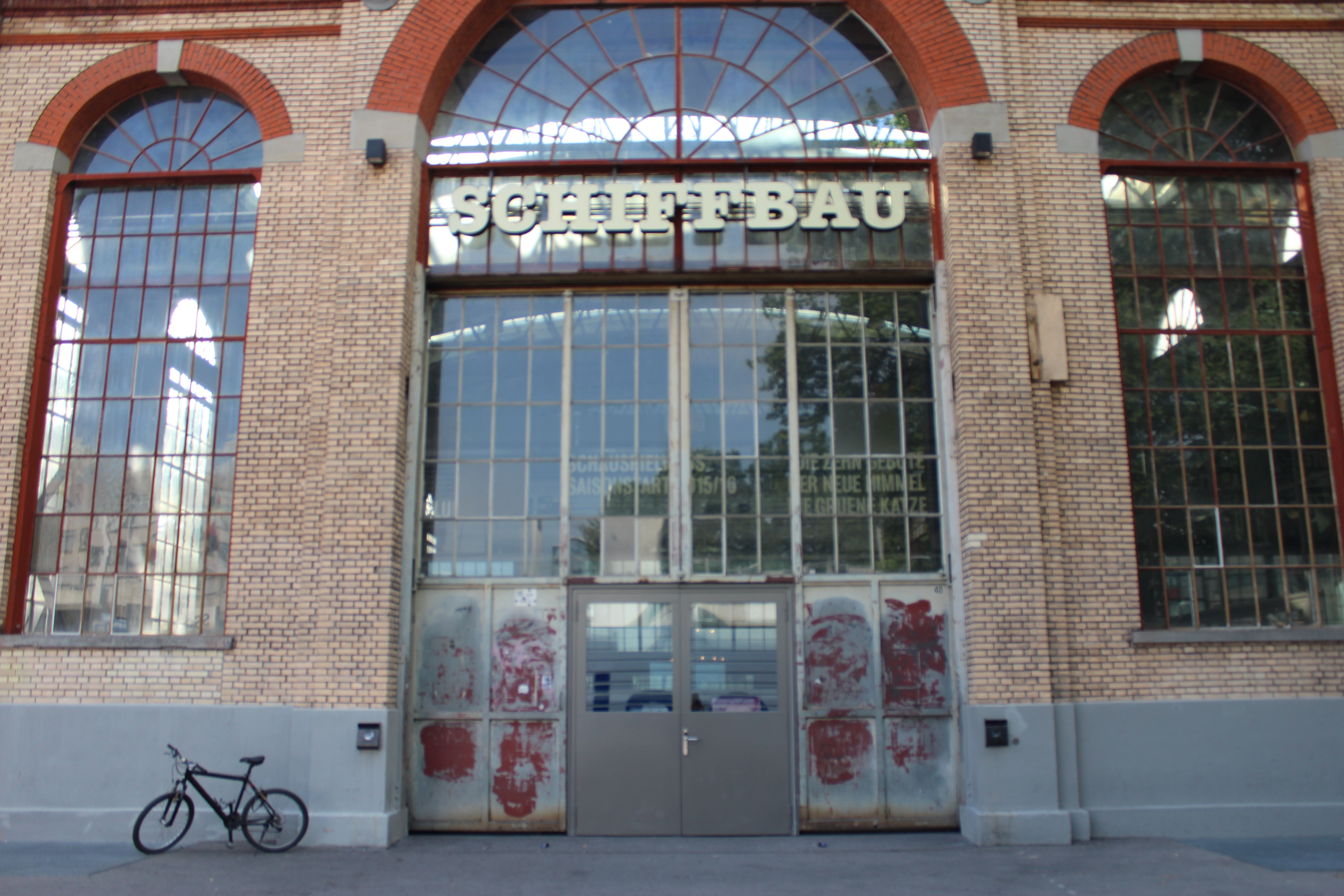
Schiffbau, Zürich
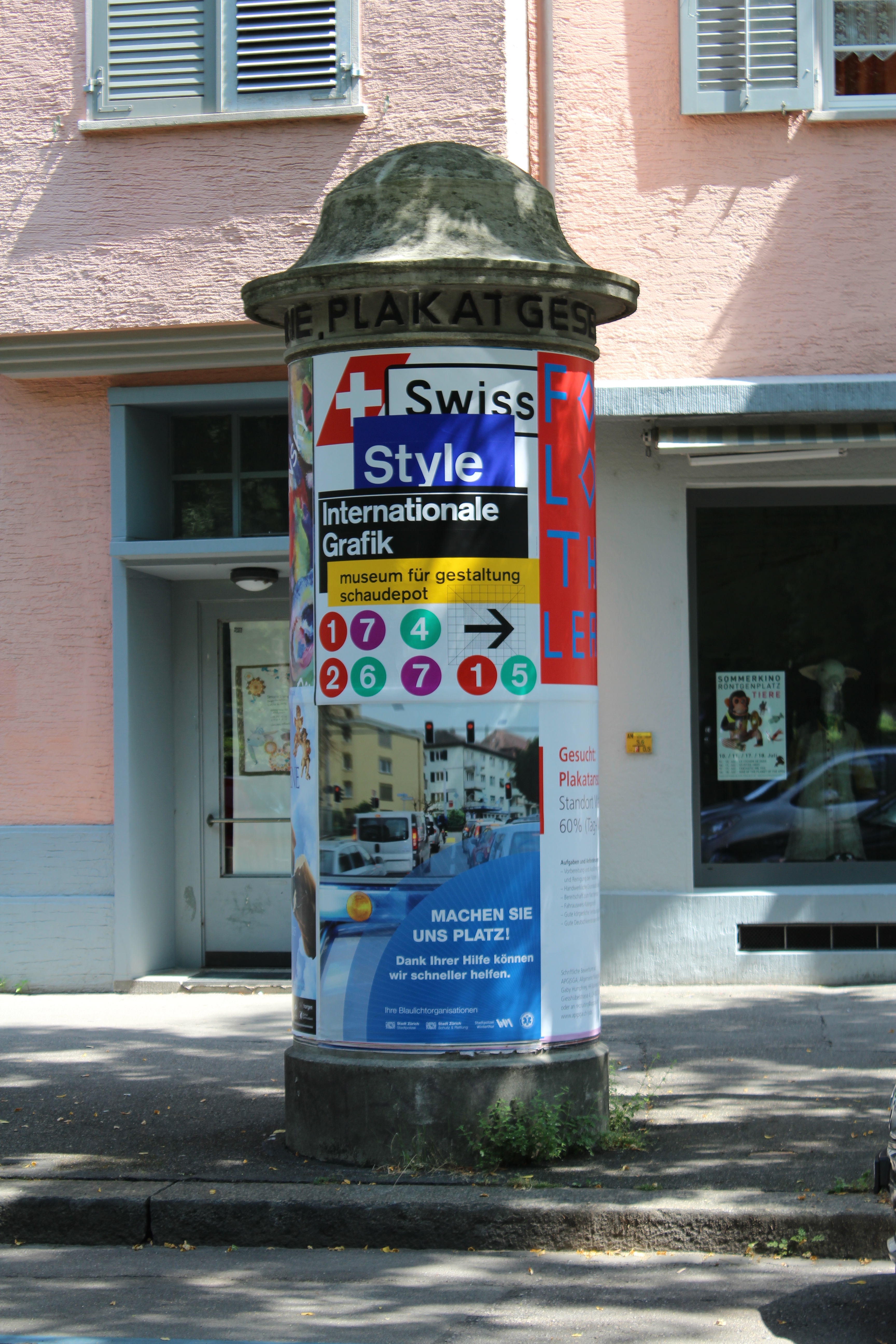
Swiss style exhibition poster
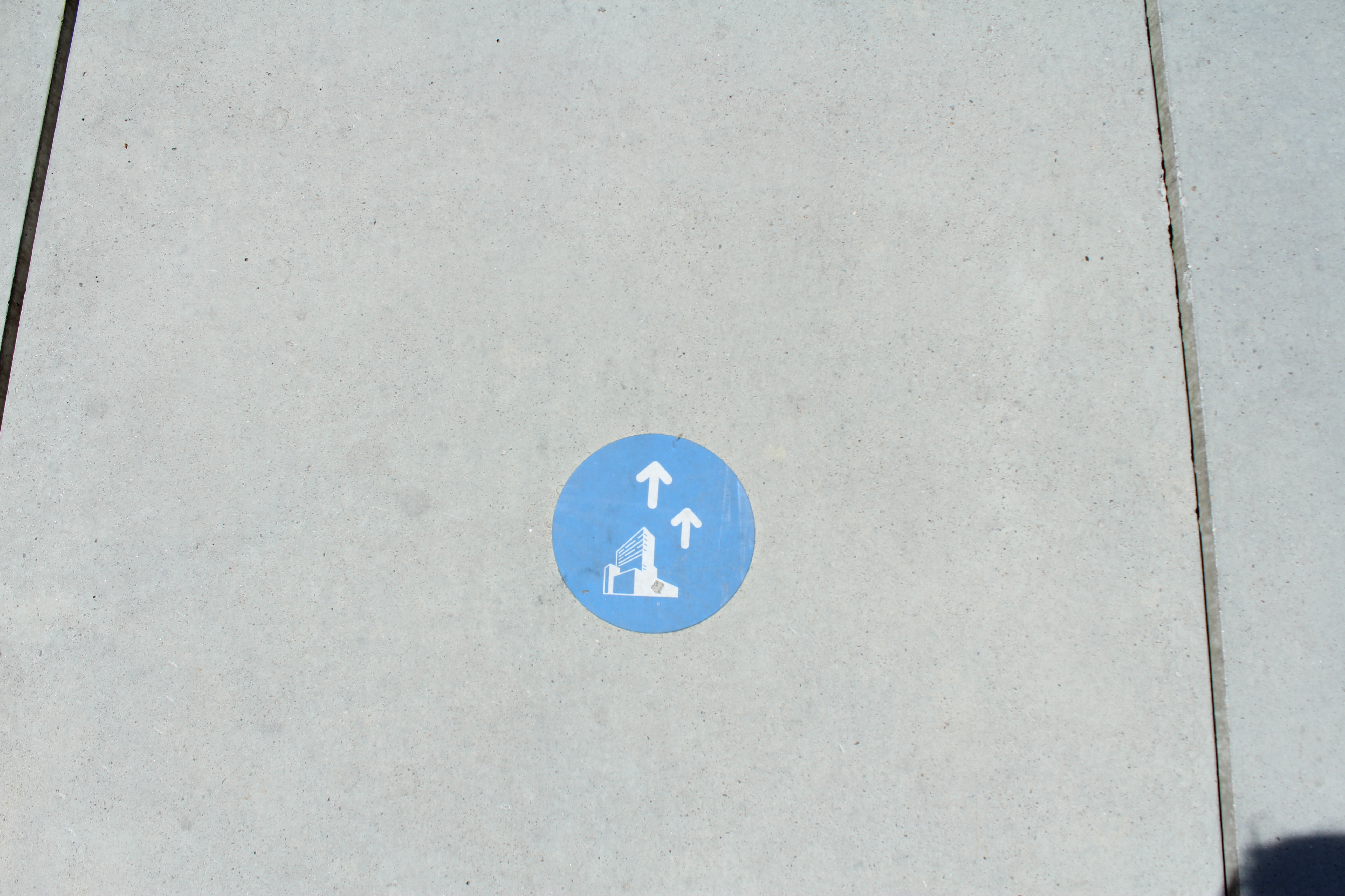
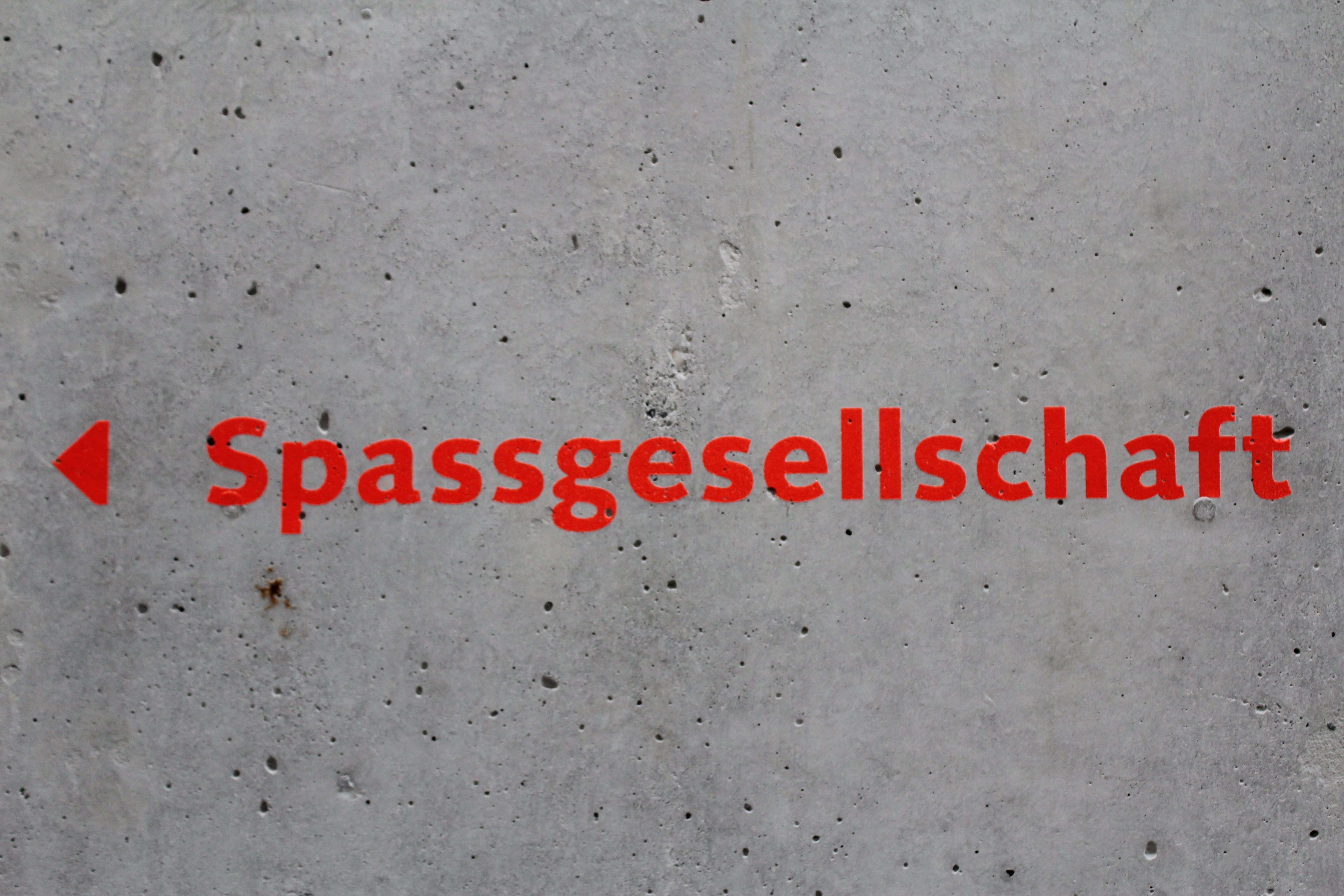
this way only
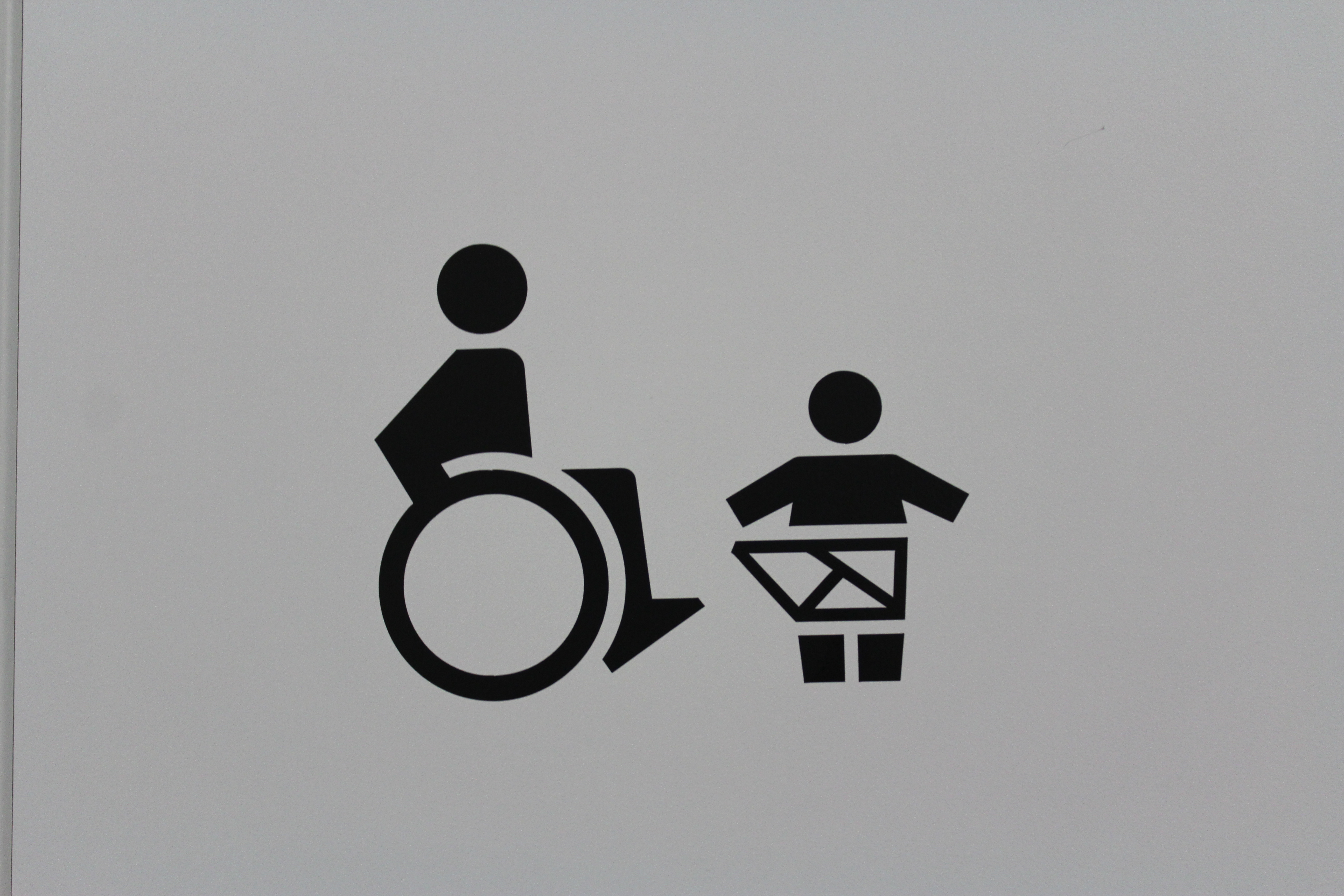
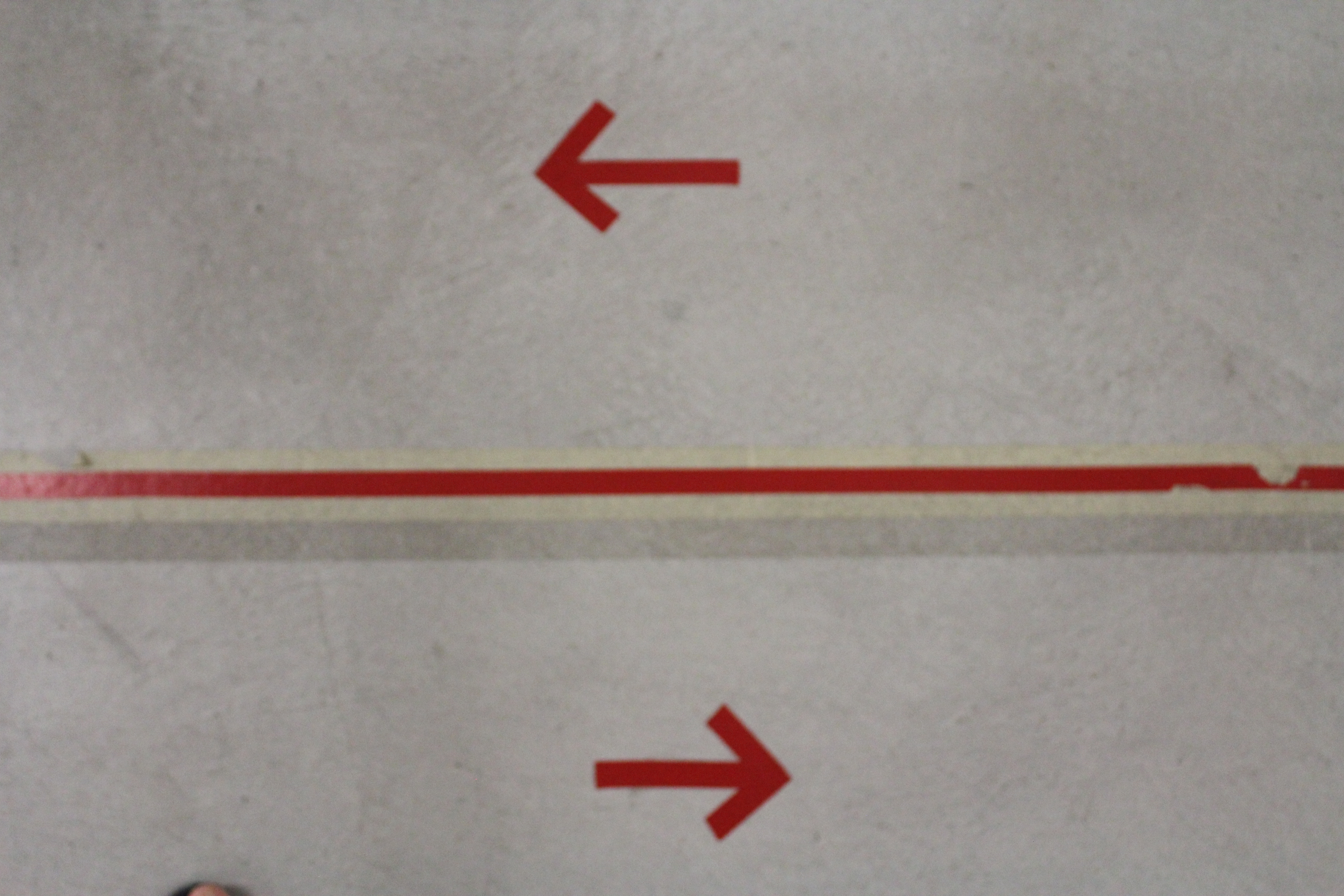
this way to… what exactly? not sure why you need two arrows
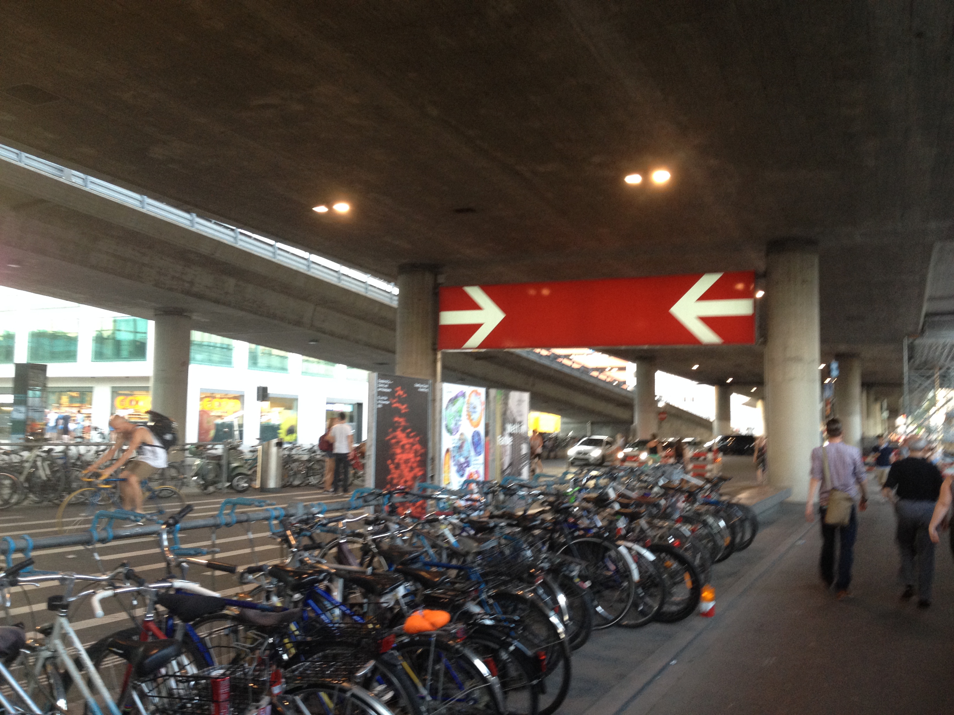
this way, no this way
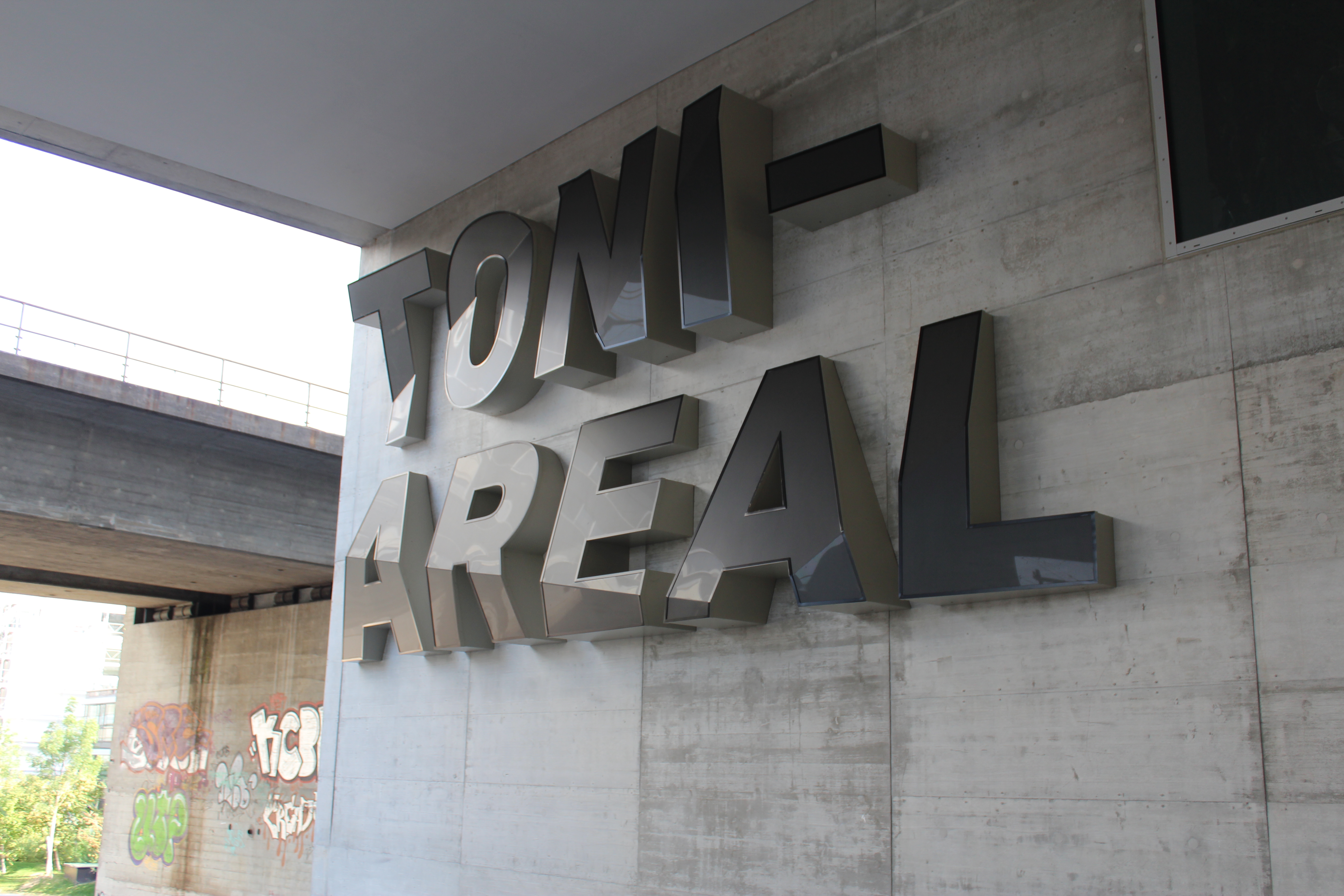
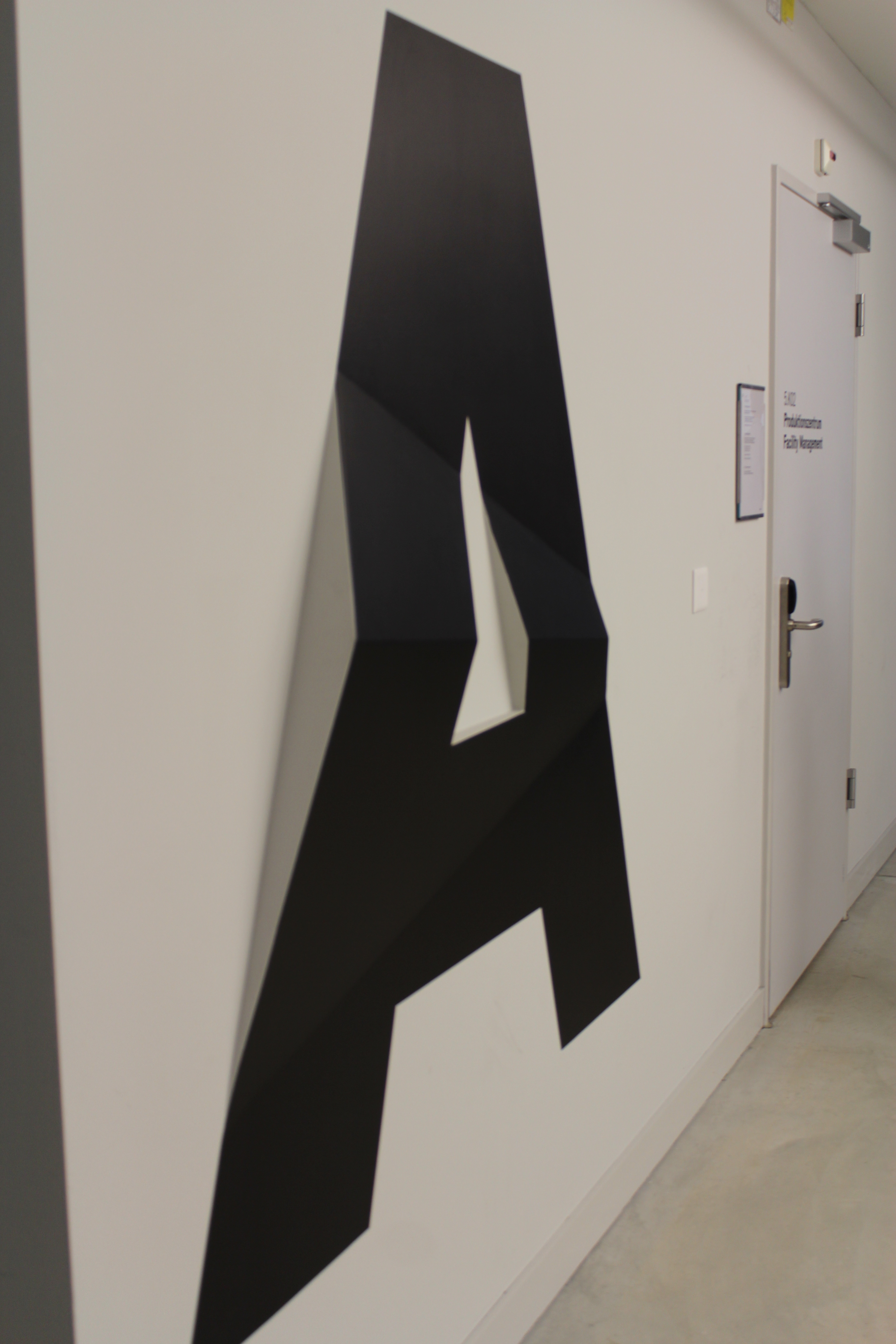
Toni Areal, Zürich. yes the letters are bent on purpose
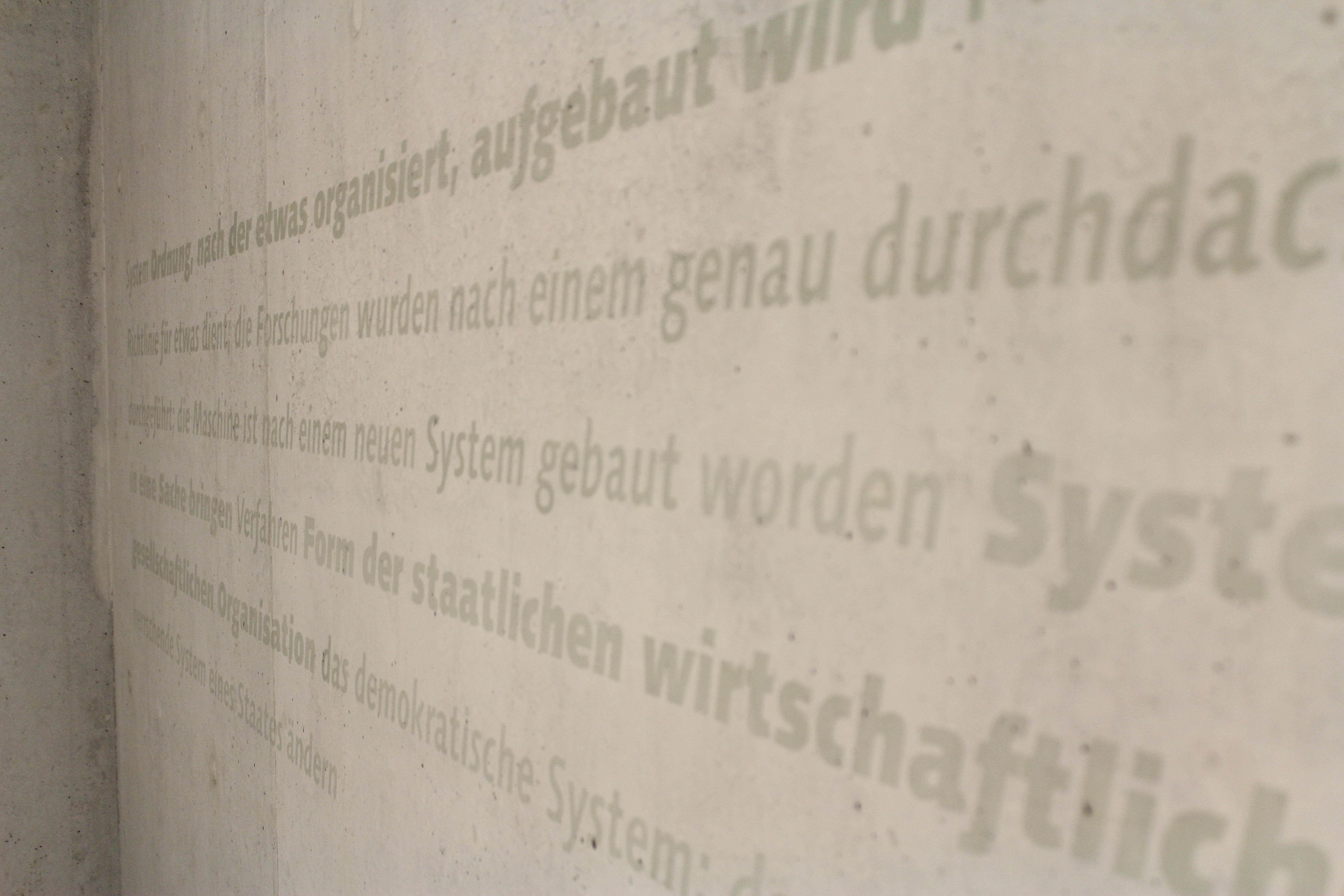
typography in the hall of PH Zürich
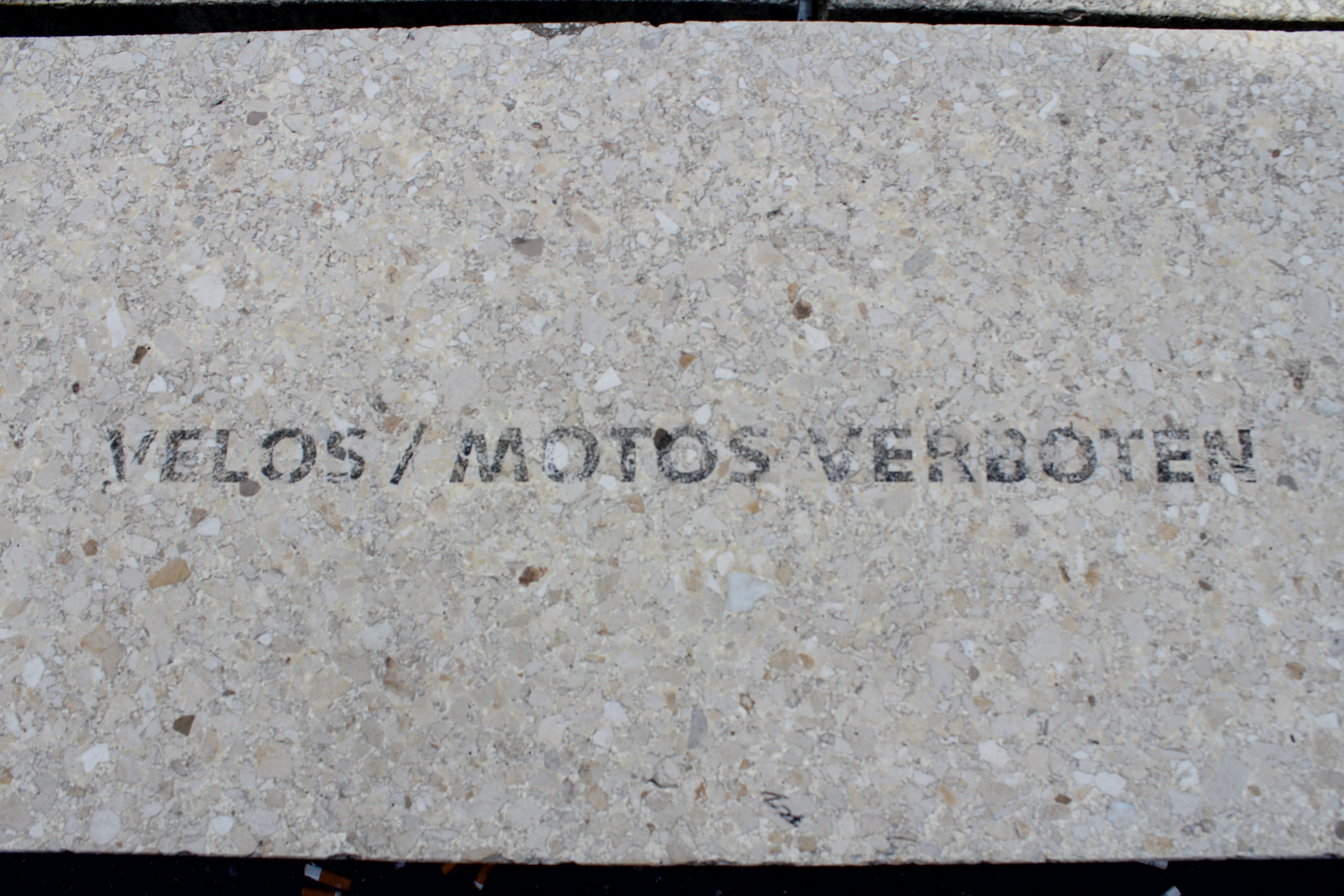
velos motos verboten PH Zürich
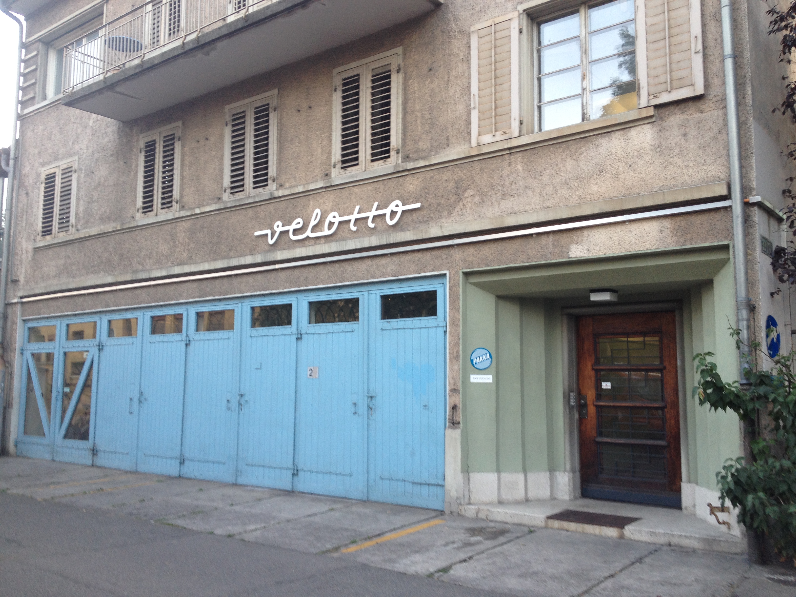
velotto Zürich
wall typography, PH Zürich
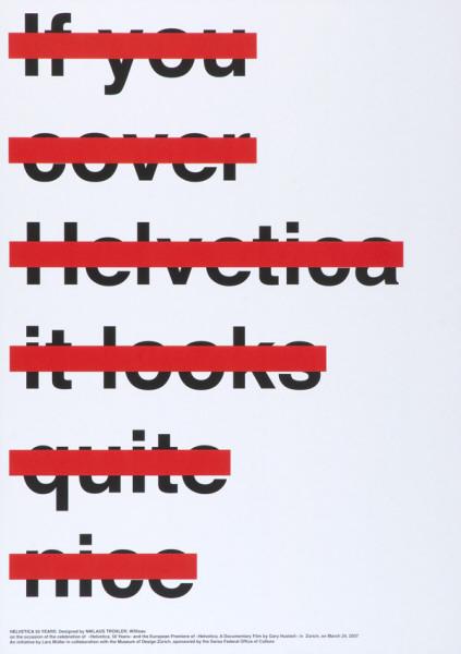 If you cover Helvetica it looks quite nice, Niklaus Troxler, 2007. troxlerart.ch